Raw, unpolished energy. Heavy black and white contrast with hot pink accent. Intentionally asymmetric layouts, overlapping elements, and aggressive typography that breaks the grid. Ugliness-as-beauty.
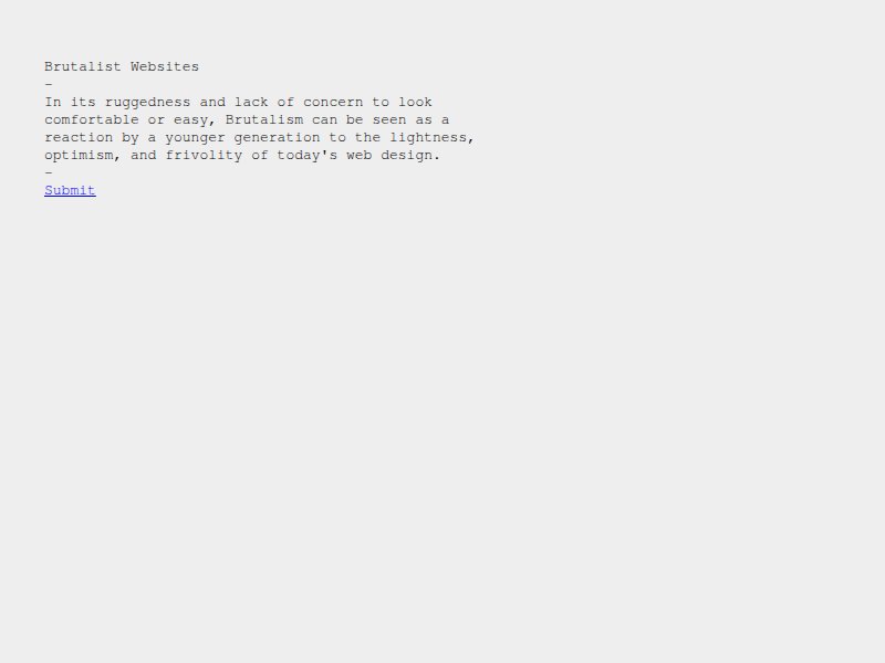
The canonical gallery. Raw grid of thumbnails, zero decoration. The site itself is brutalist — no whitespace, no hierarchy, just content density. Reference for the "wall of content" approach.
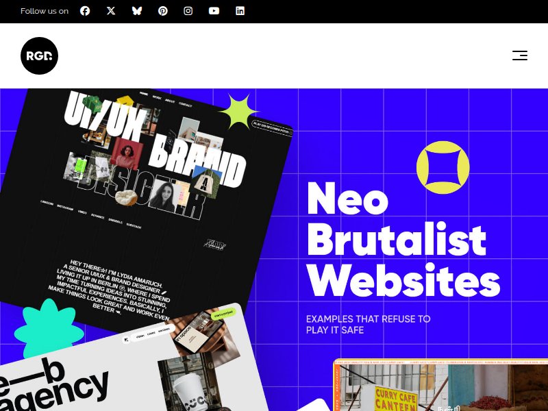
Neo-brutalist evolution. Shows how brutalism has matured — thick borders, bold shadows, high contrast color blocks. The "drop shadow on everything" technique and stark geometric cards.
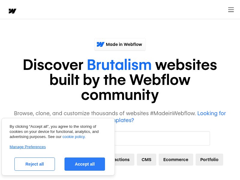
Production-quality brutalism. Curated Webflow sites that balance brutalist aesthetics with usability. Good reference for how far to push the raw look while keeping it functional.
Comprehensive breakdown. Asymmetrical layouts, visible gridlines, intentional imperfection. Shows the theory behind the aesthetic — useful for articulating design decisions.
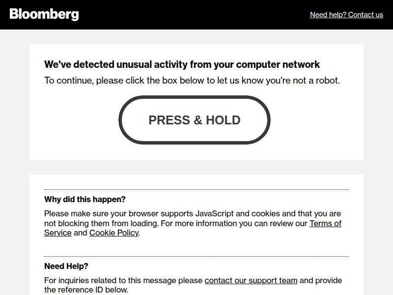
Corporate brutalism. Bloomberg's experimental graphics pages use raw, system-font aesthetics with bold data visualization. Shows how serious brands can go raw.
East London attitude. Bold color brand, edgy salon aesthetic. Known for dramatic hair transformations — the brand energy is exactly the vibe: unapologetic, loud, fashion-forward.
LA punk-rock salon. The name alone sets the tone. Dark, moody aesthetic with high-fashion edge. Good reference for how a salon brand can lean into darkness and attitude.
Practical brutalist patterns. Bold colors, raw textures, exposed structural elements. Shows how to apply brutalist principles to commercial sites without losing usability.
Template gallery. Cargo's templates lean heavily into asymmetric, editorial layouts. High-contrast options with bold typography and overlapping elements — closest to our target aesthetic.
Curated showcase. Well-documented examples of brutalism in production. Good visual catalog of techniques: monospace type, thick borders, stark contrast, raw HTML aesthetics.
Type-breaking aesthetics. Aggressive letterforms, overlapping text, broken baselines. Swiss punk influence meets digital brutalism. Key reference for the headline typography approach.
Typography curation. Clean typography showcase — useful as contrast reference. Shows what "good type" looks like so we can intentionally break those rules.
Brutalist design patterns. Unconventional layouts, bold visual clashes, raw structural exposure. Documents the specific CSS/layout techniques that create the brutalist feel.