Japanese minimalist precision. Stark white space, single thin-stroke illustrations, muted earth tones (stone gray, bamboo, miso). Every element positioned with intentional negative space and breathing room.
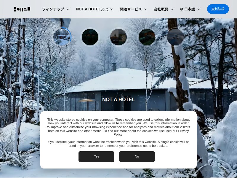
Full-bleed photography with extreme whitespace. Muted two-color palette, airy feel, subtle fade-in animations. Perfect example of Japan's move toward sustainable, minimal web design. The restraint here is the reference.
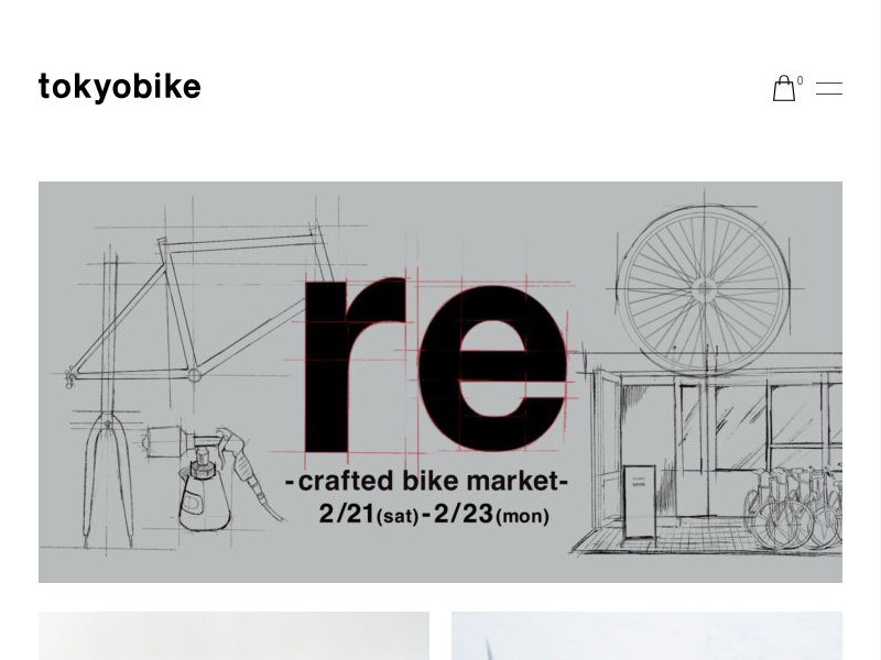
Clean product-forward layout with generous margins. Typography is thin and precise. The color palette stays within warm neutrals. Good reference for how to present workshops/products with breathing room.
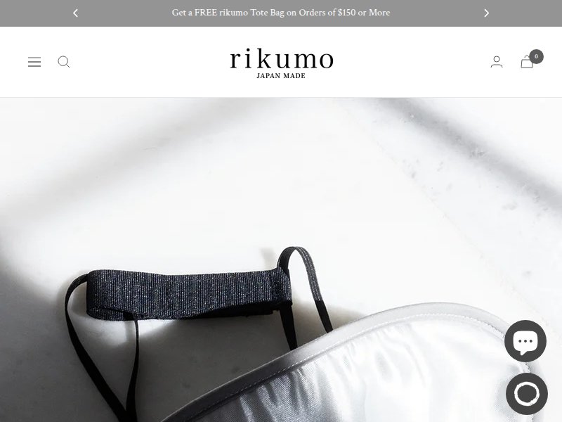
Japanese lifestyle goods with editorial sensibility. Curated grid layout, muted photography, earthy palette. The intersection of Japanese craft and modern web design — directly relevant to our cooking workshop aesthetic.
Japanese outdoor brand with restrained design language. Structured grid, natural photography, earth tones throughout. The balance of precision and warmth is exactly the tone we want.
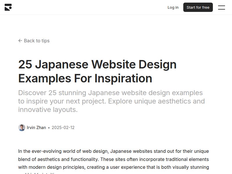
Curated collection of 25 Japanese website designs. Good survey of the spectrum — from maximalist to the clean minimalism we're targeting. Use as a jumping-off point for deeper dives.
The gold standard for editorial minimalism. Generous whitespace, restrained typography, photography-forward. The way they balance image and text with negative space is exactly the rhythm we need for workshop pages.
Cooking-forward brand with clean layout. Good reference for how a culinary brand presents workshops, recipes, and classes. Warm but structured — the content hierarchy is clear without being heavy.
High-end restaurant with radical simplicity. Minimal navigation, full-screen imagery, almost no UI chrome. The confidence to let content breathe. Relevant for the "less is more" ethos.
Handcraft ceramics with Japanese-Scandi sensibility. Earth tones, tactile photography, thin serif type. The overlap of craft workshop + minimal design is a direct parallel to our cooking workshops.
Master class in restrained luxury. Muted earth palette, thin typography, intentional spacing. Every element earns its place. The color story (amber, stone, cream) maps directly to our miso/bamboo/stone gray palette.
Hardware brand with Japanese design DNA. Clean product presentation, stark white backgrounds, precise alignment. The typography treatment — thin, spaced, uppercase — is exactly the voice we want.
Template platform with minimalist options. (Note: headless browser was blocked — visit directly to browse minimalist templates for structural inspiration.)
Visual survey of thin-stroke food illustration. Single-weight line drawings, often monochrome or with one accent color. The style we want for workshop icons and decorative elements — precise, hand-drawn feeling but controlled.
Color and composition references. Stone grays, warm beiges, miso yellows, bamboo greens. The palette direction — understated, natural, grounded. Use for color token extraction.