Nordic Spa — References

Stark simplicity, almost monochromatic. Shades of gray with a single pale blue accent. Brutal honesty about white space. Geometric severity softened only by subtle organic textures.

Nordic / Scandinavian Design

5 references
Aman Resorts homepage
aman.com

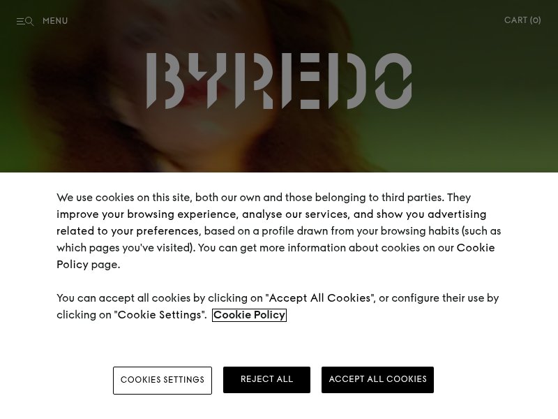
Restrained luxury as identity. Extreme whitespace, centered typography, no visual noise. The site breathes. Perfect model for how little you need when the brand is confident.

Strøm Nordic Spa
stromspa.com

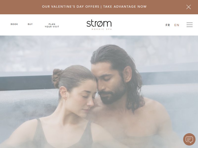
Nordic spa done right. Muted earth tones, architectural photography, generous margins. The Scandinavian wellness ethos expressed through thoughtful digital design.

Minimalist Nordic
minimalistnordic.com

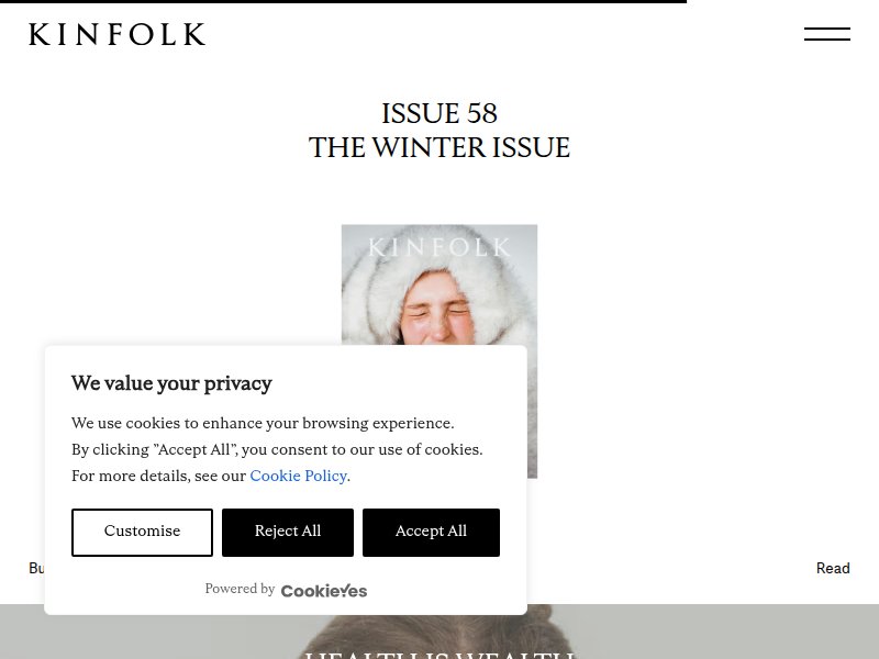
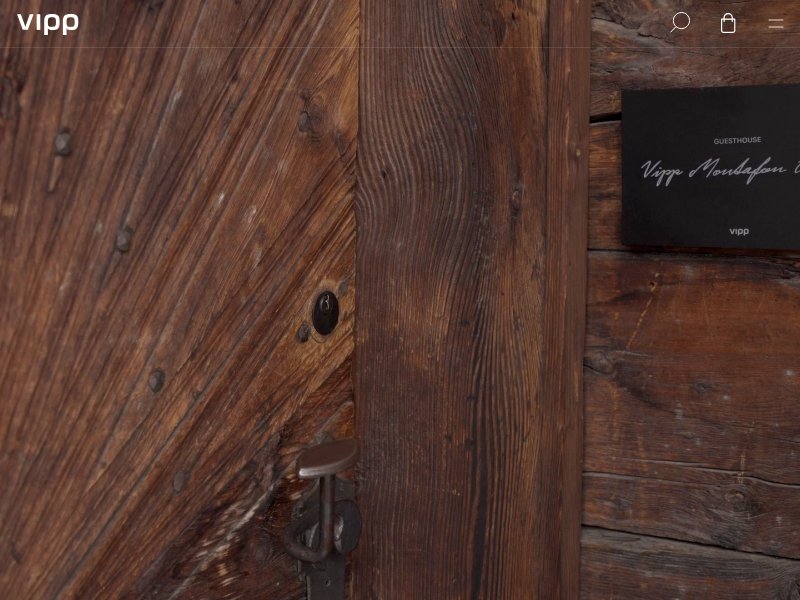
Scandinavian product aesthetic. Clean grid, neutral palette, letting objects speak. Reference for the product-as-hero approach with zero embellishment.

NÖR Plunge
norplunge.com

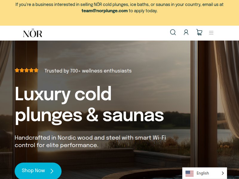
Nordic wellness brand. Direct, functional layout. The cold-water therapy angle brings an austerity that aligns with our geometric severity direction.

Norm Architects
normcph.com

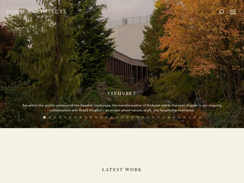
Architectural minimalism as web language. Copenhagen studio with a portfolio site that embodies soft minimalism — muted grays, natural materials, spatial awareness. Key reference for the intersection of architecture and spa.

Spa / Wellness with Strong Design

3 references
Six Senses
sixsenses.com

Wellness hospitality at scale. Clean hero imagery, restrained navigation, earthy palette. Shows how a large wellness brand maintains intimacy through design restraint.

The Conduit
theconduit.com

Members-club exclusivity. Dark, atmospheric, minimal content above the fold. The sense of withholding information creates intrigue — relevant for a spa that values privacy.

Kettal
kettal.com

Outdoor furniture as spatial design. Relevant for the organic/architectural crossover — how physical environments are presented digitally with clean lines and natural textures.

Monochromatic / Gray Palette

4 references
Kinfolk Magazine
kinfolk.com

Editorial minimalism benchmark. Near-monochromatic, serif typography, vast white space. The gold standard for "less is more" in digital editorial. Our pale blue accent would live where their warm tones do.

Aesop
aesop.com

Grayscale with material warmth. Signature amber as single accent against concrete and white. Proof that monochromatic + one accent color creates instant brand recognition. Direct parallel to our gray + pale blue strategy.

Byredo
byredo.com

Stark black-on-white commerce. Sans-serif severity, grid discipline, almost brutal simplicity. Reference for how geometric severity can still feel luxurious when the typography is right.

Everlane
everlane.com

Transparent minimalism. Neutral palette, clean grid, functional typography. Demonstrates how restraint in color and layout builds trust and clarity.

Organic Texture / Material

2 references
Muuto
muuto.com

Scandinavian materiality. Wood, stone, textile textures presented against clean white layouts. Key reference for how organic textures soften geometric severity without compromising the minimal grid.

Vipp
vipp.com

Industrial meets organic. Concrete, steel, stone — raw materials against a crisp digital layout. The tension between hard surfaces and soft light is exactly the "geometric severity softened by organic textures" we're after.