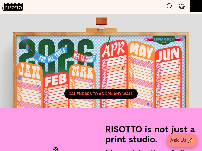
Risotto Studio
risottostudio.comcolortypography Saturated fluorescent riso inks (magenta, cyan, orange), chunky display type, checkerboard halftone patterns, deliberate misregistration. The gold standard for riso web presence.
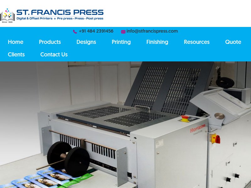
St. Francis Press
stfrancispress.comlayoutcolor Print studio web presence — how riso printers present themselves online. Notice the translation of print texture to screen.
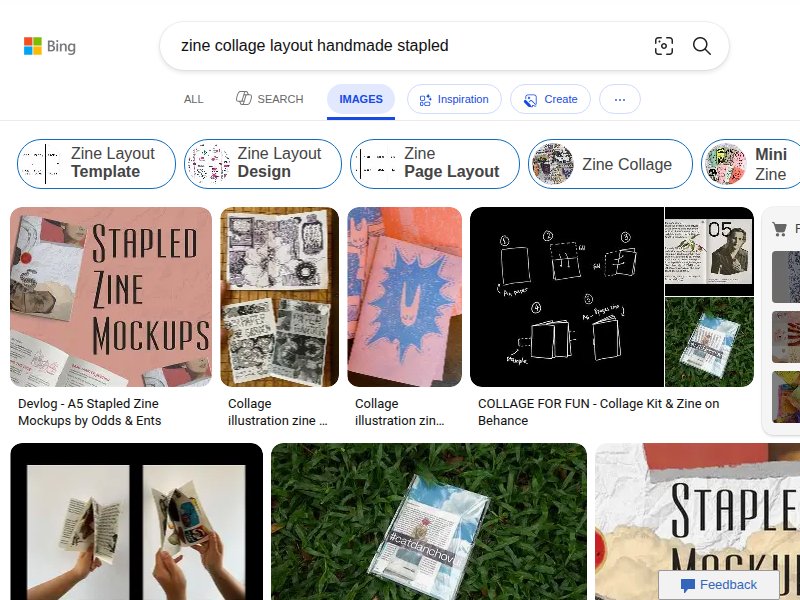
Cargo Templates — Zine Category
cargo.site/Templates/Zinelayouttypography Cargo's zine-coded templates. Lo-fi grid layouts, typewriter fonts, collage-style image placement. Key reference for how indie web translates zine energy.
Printed Matter
printedmatter.orglayouttypography NYC's premier artists' book store. Clean but with that indie bookshop energy — utilitarian grid, monospaced accents, democratic content hierarchy.
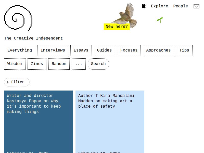
The Creative Independent
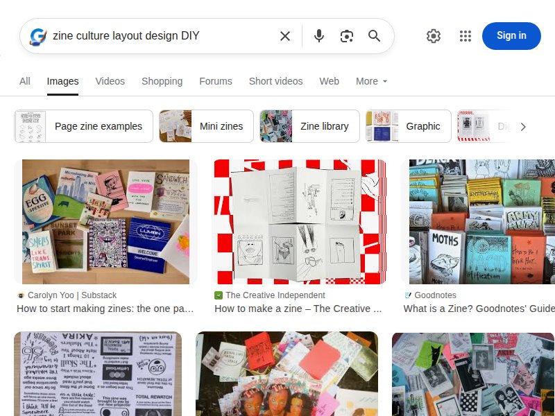
thecreativeindependent.comcolorlayout Pixelated logo, soft blue cards, yellow marker highlights. Anti-corporate minimalism, "Zines" as a nav category. Feels like one person could build it — the ultimate indie signifier.
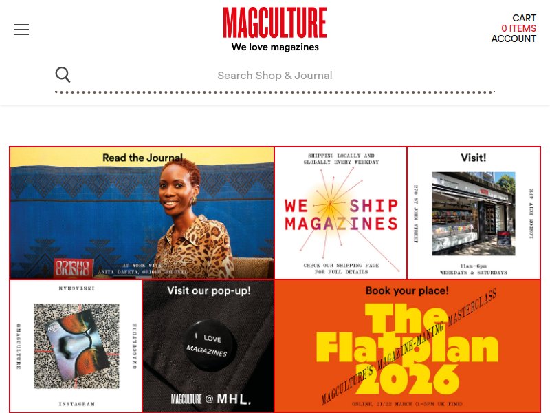
magCulture
magculture.comlayoutpattern Independent magazine culture hub. Grid-heavy, editorial layout that celebrates print craft on screen. The bridge between zine world and editorial polish.
Draw Down Books
drawdownbooks.comlayout Independent art book seller. Minimal chrome, content-forward, the inventory IS the design. Products presented without decoration.
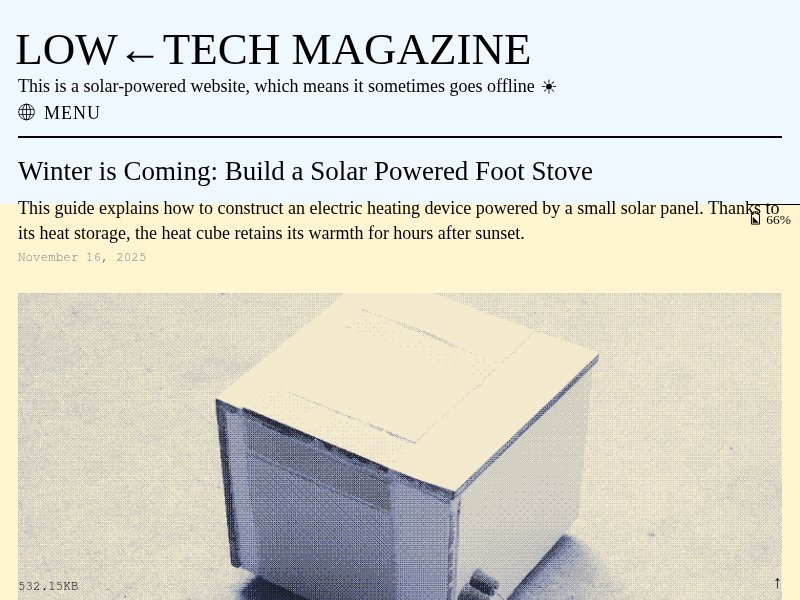
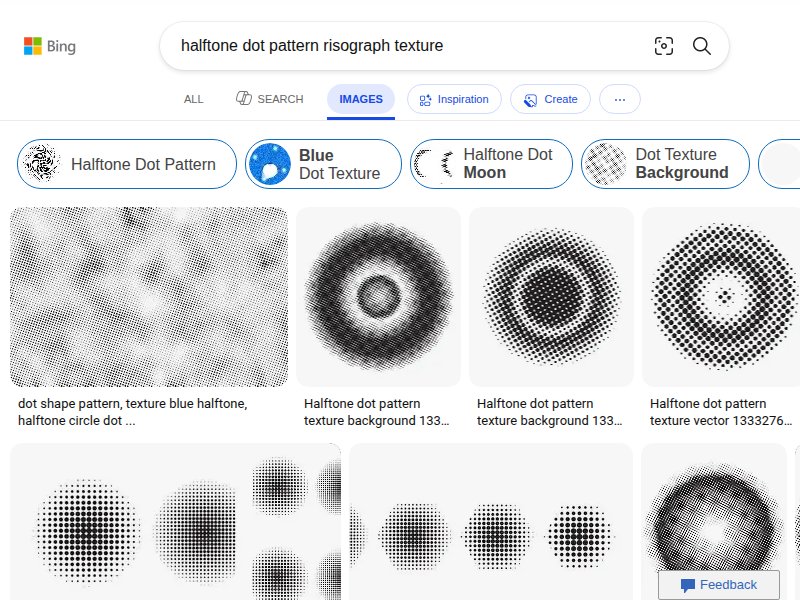
Low←Tech Magazine (Solar)
solar.lowtechmagazine.comcolorpattern Solar-powered, dithered images (riso-adjacent halftone), cream paper background, monospaced metadata. Radical austerity as aesthetic choice. Key reference for grain/texture approach.
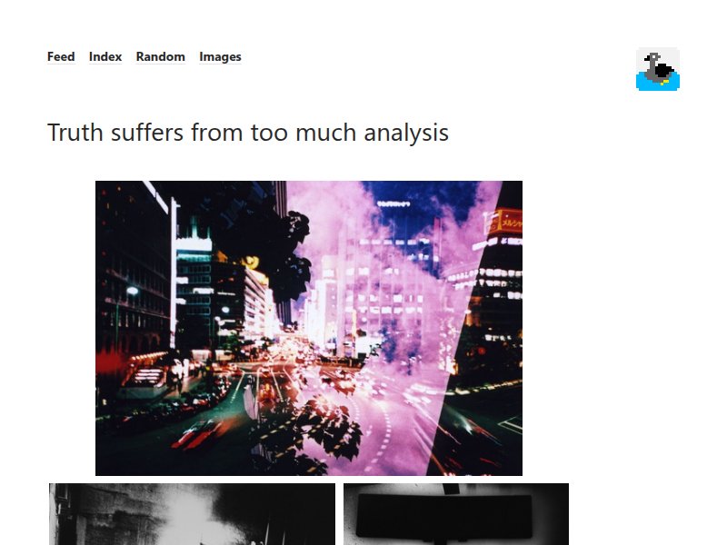
But Does It Float
butdoesitfloat.comlayout Art curation blog with minimal interface. Content-first, no decoration, lets the work speak. The anti-design approach that IS the design.
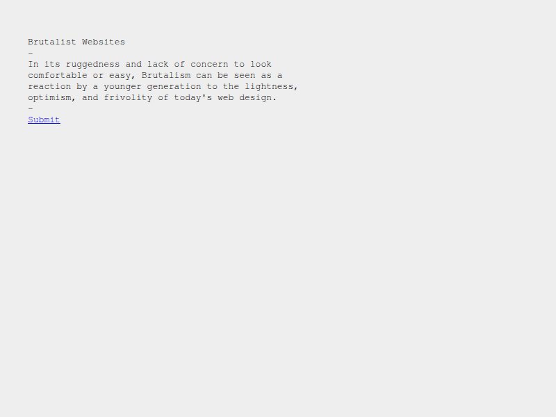
Brutalist Websites
brutalistwebsites.comlayouttypography The directory of raw, unpolished web design. System fonts, no smoothing, deliberate roughness. Zine culture's digital cousin.