Botanical archives meets cyberpunk. Scientific specimen taxonomy corrupted by digital glitch artifacts. Electric green on black. CRT terminal aesthetics applied to plant commerce.
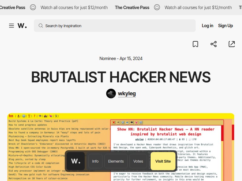
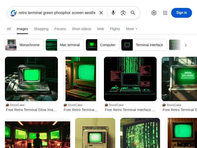
Terminal-green text on black with monospaced type. Brutalist web design meets hacker aesthetic. The exact color palette and typography vibe we're targeting — green phosphor on black, no decoration, pure data.
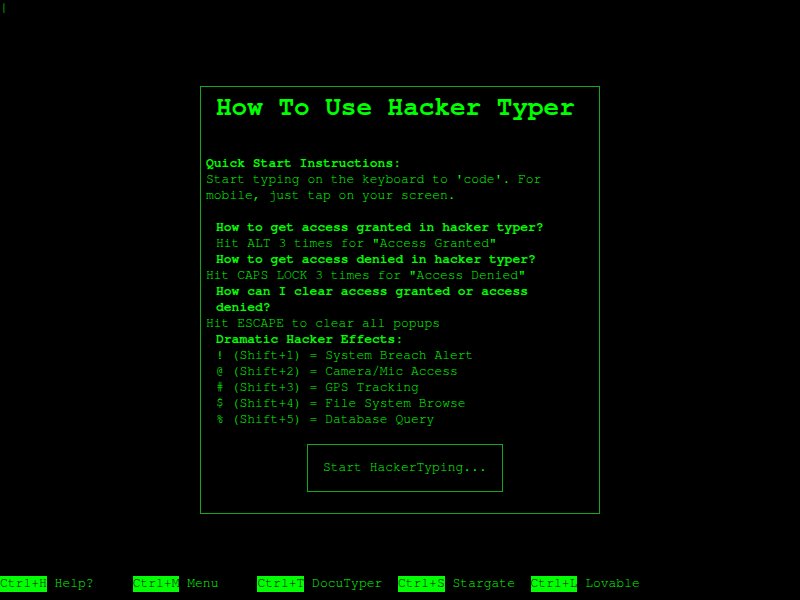
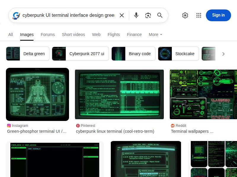
Full-screen terminal simulation. Green code on black with CRT glow effect. Shows how a full-page terminal interface feels — immersive, atmospheric, slightly ominous.
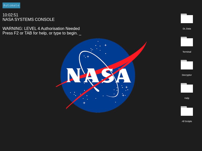
Multi-panel terminal interface with data readouts. Status indicators, bordered panels, system metadata. The layout inspiration — multiple data panels arranged in a dashboard-like grid.
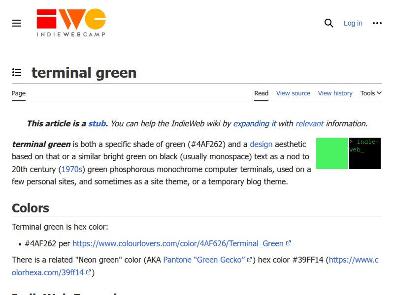
Documentation of the terminal green aesthetic as a design movement. Catalogues sites using #4AF262 / similar phosphor greens. Reference for the specific shade and community of terminal-styled personal sites.
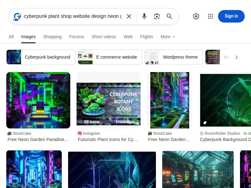
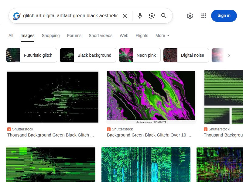
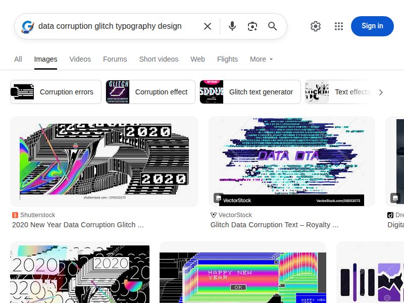
Cyberpunk design trends breakdown. Covers neon color palettes, glitch effects, geometric gradients, and digital background patterns. Good overview of the visual vocabulary.
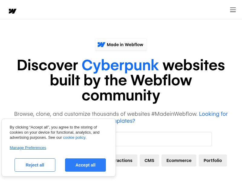
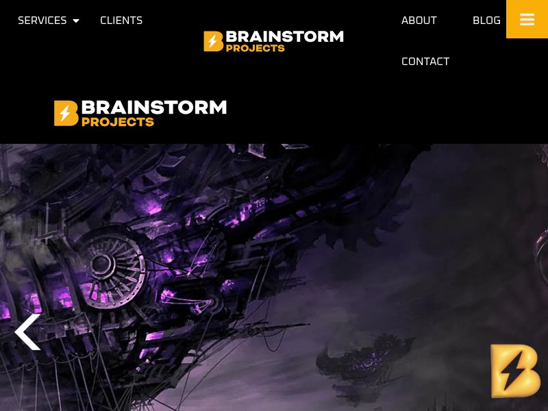
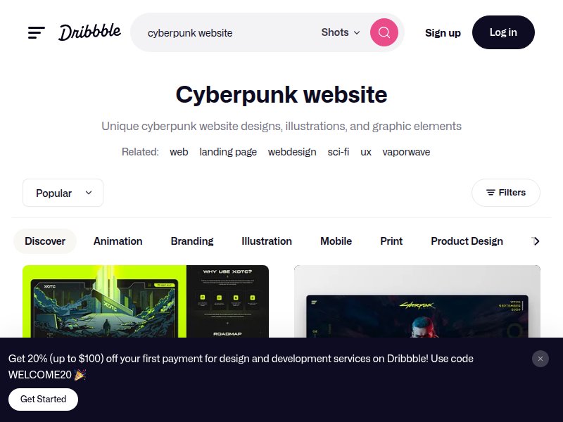
Gallery of cyberpunk-themed websites. Multiple live examples showing how the aesthetic translates to actual web layouts — navigation, grids, typography, dark UIs.
Design concepts for cyberpunk web UIs. High-fidelity mockups showing dark interfaces with neon accents, terminal elements, and futuristic typography treatments.
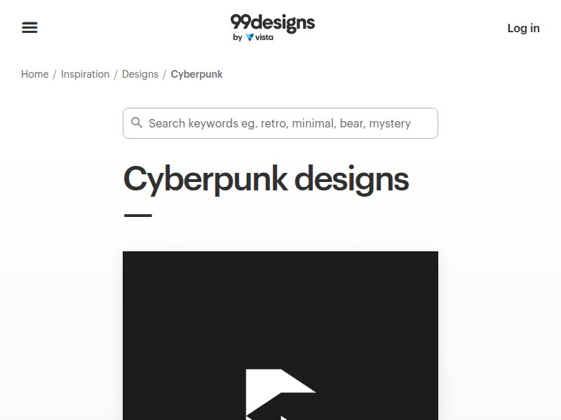
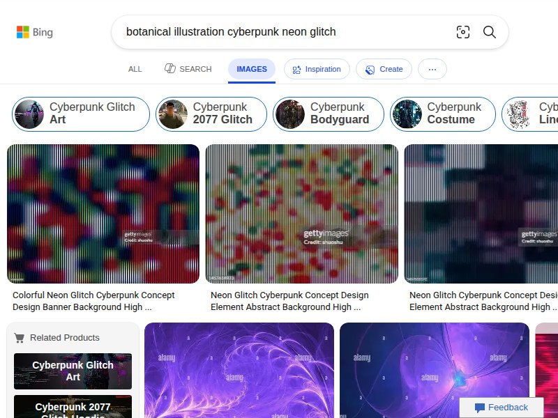
Cyberpunk design gallery. Logos, illustrations, and branding in cyberpunk style — neon glows, glitch effects, dark cityscapes. Useful for the brand identity treatment.
Clean systematic grid layout. The structural precision that underpins our terminal aesthetic before adding the cyberpunk layer.
Template gallery showing diverse layout approaches. Strong typography, editorial grids, portfolio layouts. The baseline quality level we're aiming for.
Curated dark website gallery. How high-end sites handle dark backgrounds: typography contrast, navigation, content hierarchy, white space on black.
Real herbarium database interface. How actual botanical archives present specimen data — search fields, collection metadata, taxonomy hierarchy. The functional reference for our "database" UI.
4.2 million specimen records with search interface. Keyword search, field-based search, taxonomic grouping. The data-dense UI pattern we're channeling — forms, fields, structured results.
Kew's herbarium presentation. How a world-class institution describes dried specimens, cataloging, and arrangement by family/genus/species. The language and hierarchy of botanical classification.
Museum collection database with specimen counts and type specimens. The institutional voice of botanical science — precise, archival, systematic. Informing our "system status" and record-count aesthetic.
Six collections, five million specimens. Academic presentation of botanical archives. Clean institutional design with deep data navigation — search tools, collection browsing, taxonomic exploration.
Modern plant e-commerce leader. Filter by light needs, pet-safe, size. Product card hierarchy: image → name → price → quick-add. The conventional patterns we're subverting with terminal aesthetic.
Playful plant e-commerce with personality. Shows how a plant shop can have a strong visual identity beyond generic garden-center vibes. Our version takes "personality" to the extreme.
Premium plant delivery with strong UX. Clean product cards, care-level indicators, size options. The e-commerce patterns we need to make functional even inside our terminal UI.
Elevated plant shopping with editorial feel. Large product photography, lifestyle staging, sophisticated typography. The "premium" positioning — our version achieves premium through technical precision instead of lifestyle imagery.
Local plant shop with strong brand. Shows how a neighborhood plant shop presents online — location focus, community feel, curated selection. The "visit us" page reference.
Curated glitch art and digital corruption. The visual language of data decay — chromatic aberration, pixel displacement, scanline artifacts. Direct reference for our "corrupted botanical database" effect.
Award recognition for terminal + glitch + brutalist web design. Shows the aesthetic has design-community credibility. Built with a single index.html — proving the approach works as self-contained files.
Chiaroscuro botanical specimens. Golden/luminous plants on pure black — Dutch Golden Age meets scientific documentation. Plants as dramatically lit isolated specimens.
Neon meets nature. Plants in neon-lit environments, the collision of organic growth and synthetic light.
Herbarium specimen labels. Handwritten and printed classification: family, genus, species, collector, date. The typography of scientific cataloging.
Digital corruption in our exact palette. Horizontal displacement, color channel splitting, scanline artifacts, pixel sorting. The glitch vocabulary.
Green phosphor terminal interfaces. Monospaced type, bordered panels, data readouts, system status indicators. The primary layout language.
Botanical forms corrupted by digital effects. Plant illustrations with glitch overlays — the exact aesthetic intersection we're building.
Digitized herbarium specimens. Pressed plants photographed against dark backgrounds, with metadata labels. The source material our CSS art is abstracting.
Dark plant shop precedents. How others handle plants on dark backgrounds — most go moody/editorial. Our approach is clinical/technical, which differentiates.
CRT phosphor glow and scanlines. The atmospheric layer: text-shadow glow, horizontal scanline overlays, slight curvature vignetting. Warm green on true black.
Technical plant anatomy illustrations. Clean line drawings: cross-sections, root systems, leaf venation. What the CSS-only botanical art should evoke.
Vintage specimen card formatting. Structured data fields: date, location, habitat, notes. Monospaced type on cards. Direct inspiration for plant card components.
Corrupted text as design element. Chromatic aberration on type, displaced fragments, partially rendered characters. The headline treatment for brand identity.