Japanese mingei folk craft philosophy meets contemporary gallery. Wabi-sabi imperfection, earth tones with cobalt blue, kiln fire warmth, functional pottery as art.
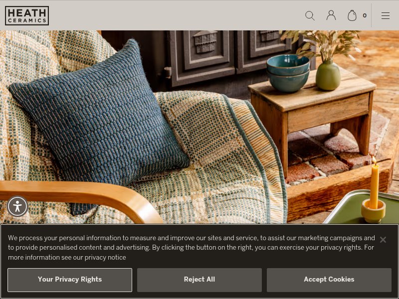
Warm, editorial lifestyle photography. Full-bleed hero, earthy teal/olive/mustard palette, minimal nav. Premium craftsman feel — warm and immersive, not cold e-commerce.
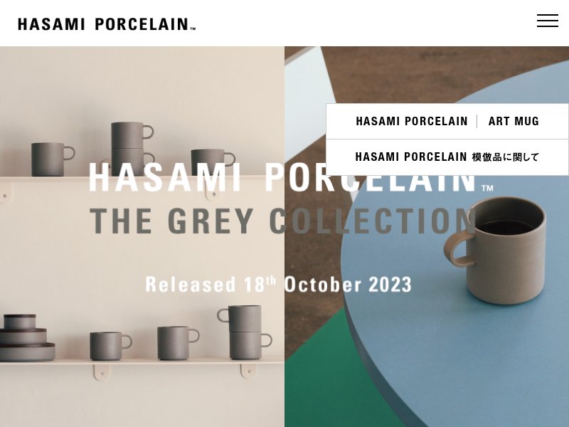
Japandi minimalism — split-screen diptych hero. Clean sans-serif with generous letter-spacing, muted earthy palette with teal accent. Gallery-like restraint. Japanese/English bilingual integration.
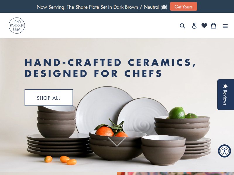
Chef-focused ceramics brand. Clean product photography, professional e-commerce layout. Shows how to present functional pottery as premium tableware.
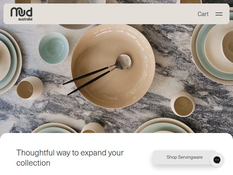
Photography-forward, quiet UI. Rounded lowercase logo, serif italic headlines, full-bleed lifestyle imagery. Muted sage/celadon/cream palette. The UI disappears to let product speak.
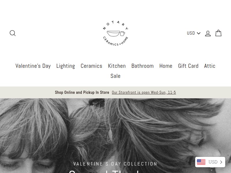
Small studio ceramics shop. Handmade feel with personal maker story integration. Shows the scale we're targeting — artisan not industrial.
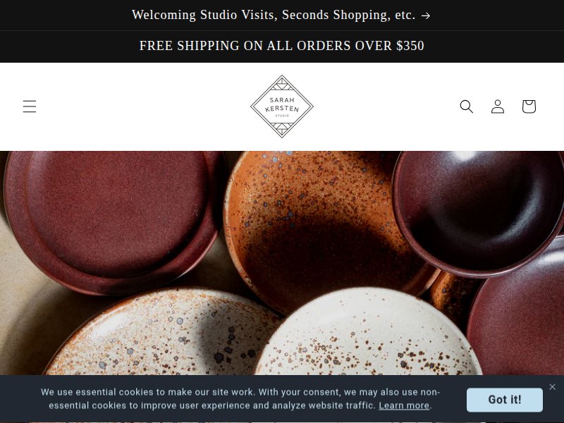
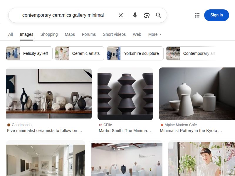
Solo ceramicist portfolio-shop hybrid. Clean white background, product-as-art presentation. Blurs line between gallery and store.
The Mingei museum itself. Clean institutional design, celebrates folk art with contemporary presentation. Good reference for how to frame mingei philosophy in web context.
Traditional Japanese pottery reference. Shows authentic pottery presentation, naming conventions, cultural context for ceramic forms.
Warm earth tones, hand-thrown forms, visible texture. Irregular shapes celebrated. Natural glazes in browns, grays, blues. The beauty of imperfection.
White space as philosophy. Asymmetry, organic forms, muted palettes. Shows how wabi-sabi translates to digital — restraint, breath, imperfection as feature.
Gallery-style presentation. Objects on pedestals, generous spacing, white walls. Each piece treated as sculpture.
Our accent color in context. Cobalt blue against warm clay, stone, cream. The contrast is striking but natural — like sky against earth.
Fire-born color transitions. Warm oranges through ashy grays, the gradient of a kiln firing. Translates to CSS gradients for section backgrounds.
Raw studio atmosphere. Wooden shelves, natural light, tools, clay dust. The warmth and texture of the making space. Informs the "about" page feel.
How to photograph handmade. Natural light, linen/wood surfaces, styled but not overdone. Each piece shot to show texture and glaze variation.