Organic Skincare — Viennese Secession — References

Gustav Klimt gold leaf patterns, Art Nouveau botanical borders, decorative frames, maximum ornamentation. Opulent craft meets clean beauty.

Style References

6 references
Aesop
aesop.com
Aesop — Masterclass in elevated skincare e-commerce. Restrained typography with warm earthy tones. Note the generous whitespace and editorial product presentation. We'll push beyond their minimalism into ornamental territory but keep their sense of quiet luxury.
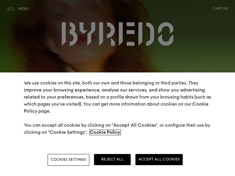
Byredo
byredo.com
Byredo — Clean grid layout with sophisticated typography. The monochromatic palette and bold type create a gallery-like feel. Relevant for understanding how luxury beauty brands use negative space — our ornamental frames will fill that space with Secession patterns.
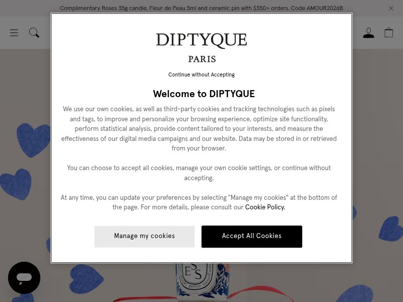
Diptyque
diptyqueparis.com
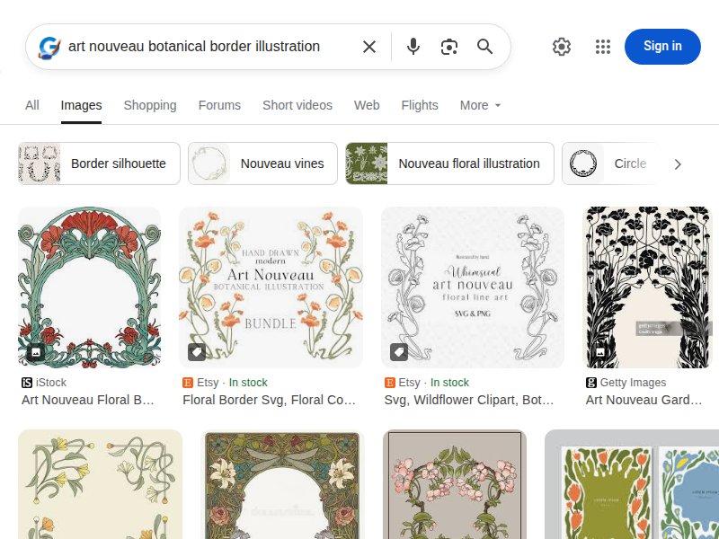
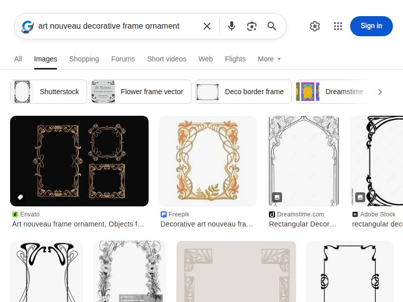
Diptyque — Closest to our direction among luxury brands. Their oval label design is essentially an ornamental frame. Note the botanical illustration tradition in their branding — direct lineage from Art Nouveau botanical plates. Their use of decorative borders around product categories is a key reference.
Guerlain
guerlain.com
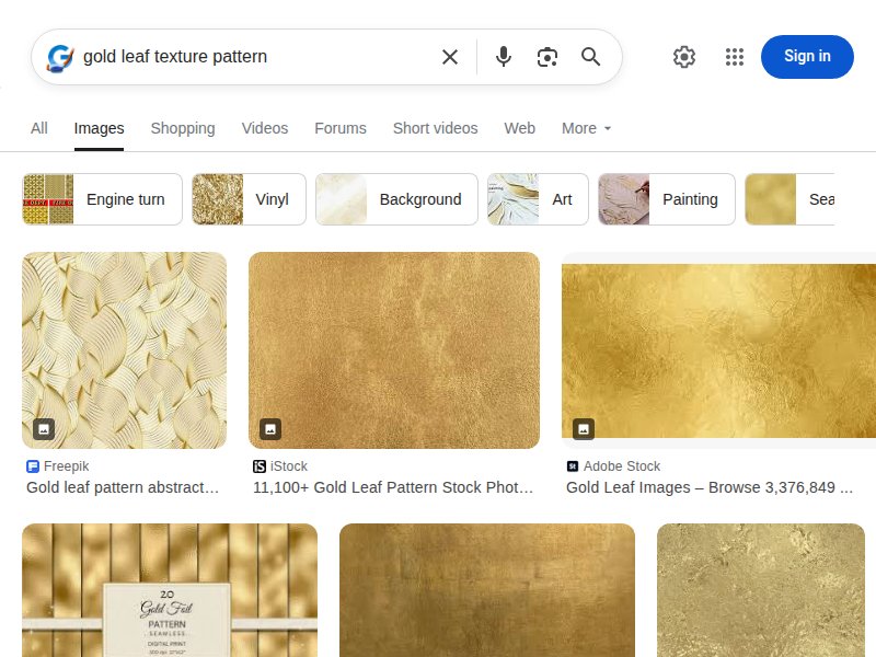
Guerlain — Heritage luxury with ornamental DNA. The bee motif, gold accents, and decorative packaging draw directly from Art Nouveau craftsmanship. Study their gold-on-white palette and how gilded elements frame content sections. This is our closest industry analog for tone.
Tatcha
tatcha.com
Tatcha — Japanese-inspired ornamental luxury. Gold foil accents on white/purple, decorative patterns as texture, and a ritual-based product storytelling approach. Their ingredient pages with botanical detail are a direct reference for our Botanical Garden section.
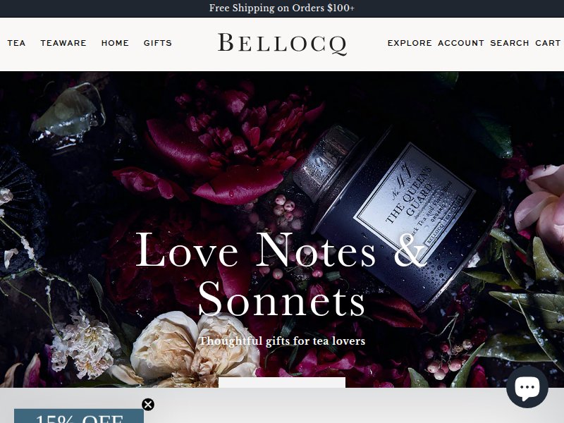
Bellocq Tea Atelier
bellocq.com
Bellocq Tea Atelier — Artisanal brand with strong decorative identity. Their ornamental packaging and editorial photography feel hand-crafted and luxurious. The "atelier" positioning mirrors our brand story. Note the warm, golden-hour color palette.

Movement & Era References

5 references
Vienna Secession Building
secession.at
Vienna Secession Building — The source. Olbrich's golden dome, the "Ver Sacrum" motto, white walls with gold ornamental crowning. This is our exact palette direction: white/cream structure with gold decorative elements. The laurel leaf dome is pure ornamental excess.
Gustav Klimt
klimt.com
Gustav Klimt — The gold leaf master. "The Kiss," "Tree of Life," "Portrait of Adele Bloch-Bauer" — all demonstrate flat gold patterning over organic forms. Key technique: geometric/spiral patterns filling negative space around figurative elements. This is our CSS pattern philosophy.
Vienna Secession Wikipedia
en.wikipedia.org/wiki/Vienna_Secession
Vienna Secession overview — Historical context for the movement. Key figures: Klimt, Moser, Hoffmann, Olbrich. The Secession was specifically about breaking from academic art to create total works of art (Gesamtkunstwerk) — every element designed, nothing left unadorned. This is our philosophy.
Koloman Moser
en.wikipedia.org/wiki/Koloman_Moser
Koloman Moser — The pattern master of the Secession. His geometric botanical patterns, repeating vine motifs, and decorative borders are more directly translatable to CSS than Klimt's paintings. Study his Ver Sacrum illustrations for border and divider patterns.
Art Nouveau
en.wikipedia.org/wiki/Art_Nouveau
Art Nouveau movement — Broader context. The whiplash curve, organic line, and "total design" philosophy define the aesthetic language. Every element — from typography to navigation — should flow with organic, curving forms rather than rigid grids.

Industry References

3 references
Drunk Elephant
drunkelephant.com
Drunk Elephant — Clean beauty category leader. Bright, playful, ingredient-first. Their ingredient transparency and "what's in / what's out" approach is the industry standard we need to match — but wrapped in Secession ornamentation instead of their modern pop aesthetic.
OSEA Malibu
oseamalibu.com
OSEA Malibu — Ocean-botanical skincare. Clean layout, strong ingredient storytelling, ritual-based product usage. Their product detail pages with usage instructions and botanical callouts are a functional reference for our PDP structure.
Luxury Skincare Packaging
Google Image Search — Organic Skincare Luxury Packaging
Packaging design moodboard — Survey of luxury organic skincare packaging. Note recurring themes: botanical illustrations, gold foil stamping, ornamental borders on labels, cream/kraft backgrounds. Our web design should feel like these packages came to life as a website.

Pattern & Texture References

2 references
Gold Leaf Textures
Google Image Search — Gold Leaf Texture
Gold leaf texture reference — Study the crackle, variation, and warmth of real gold leaf. Our CSS gold effects should suggest this materiality through gradients and subtle noise — not flat gold, but living, textured gold with depth.
Ornamental Border Patterns
Google Image Search — Art Nouveau Ornamental Borders
Ornamental border patterns — Catalog of Art Nouveau border styles. Key patterns: vine-and-leaf repeating borders, corner rosettes, flowing S-curves, geometric interlocking forms. These translate to CSS border-image, pseudo-elements, and SVG patterns.

Image Search Moodboards

8 references
Viennese Secession Ornamental Design
Secession ornamental vocabulary — The geometric-organic hybrid that defines the movement. Laurel wreaths, stylized flowers, repeating circles and squares in gold on white. Note how ornament is structural, not applied — it defines the composition.
Klimt Gold Leaf Patterns
Gustav Klimt Gold Leaf Pattern
Klimt's gold patterns — Spirals, triangles, circles, eyes, and organic shapes in flat gold against darker grounds. The key insight: Klimt's patterns are modular — small geometric units that tile and flow. This is directly achievable in CSS with repeating gradients and SVG.
Art Nouveau Botanical Borders
Art Nouveau Botanical Border Illustration
Botanical border illustrations — The language of Art Nouveau borders: sinuous stems, unfurling leaves, budding flowers as corner ornaments. These can be rendered as inline SVGs for our section dividers and card frames.
Secession Style Website Design
Secession-inspired web design — Contemporary interpretations. Study how designers translate ornamental excess to screen — gold gradients, decorative borders, serif typography with ornamental flourishes. Key challenge: performance with heavy ornamentation.
Art Nouveau Decorative Frames
Art Nouveau Decorative Frame Ornament
Decorative frame ornaments — Every product card, every content section needs a frame. These references show the vocabulary: flowing top bars, corner flourishes, base pedestals. CSS implementation via borders, pseudo-elements, and clip-paths.
Wiener Werkstätte Decorative Arts
Wiener Werkstätte — The design workshop arm of the Secession. Total design: furniture, textiles, ceramics, graphics — all with consistent ornamental language. Their geometric patterns (squares, checkerboards, stylized roses) are simpler and more CSS-friendly than Klimt's paintings.
Klimt Tree of Life
Klimt Tree of Life Decorative
Tree of Life motif — Klimt's most botanical work. The spiraling branches, golden leaves, and eye-shaped fruits are a perfect hero element. This single motif could define our entire ornamental system — spirals for navigation, leaves for dividers, the tree for the hero.
Art Nouveau Beauty Website
Art Nouveau Skincare Beauty Website
Art Nouveau beauty web design — Where our two worlds collide. Examples of beauty brands using ornamental, Art Nouveau-inspired design. Study what works and what feels dated vs. fresh. The best examples use ornamentation structurally, not as wallpaper.