Visual references for a specialty coffee website inspired by Wiener Werkstätte geometric craft — Josef Hoffmann checkerboards, Koloman Moser patterns, black/white/gold palette, ornamental geometry, Art Deco stepped frames.
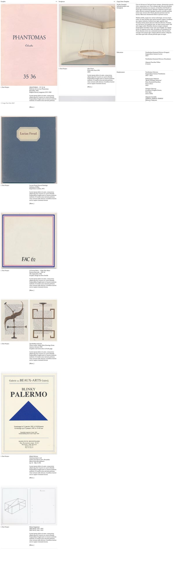
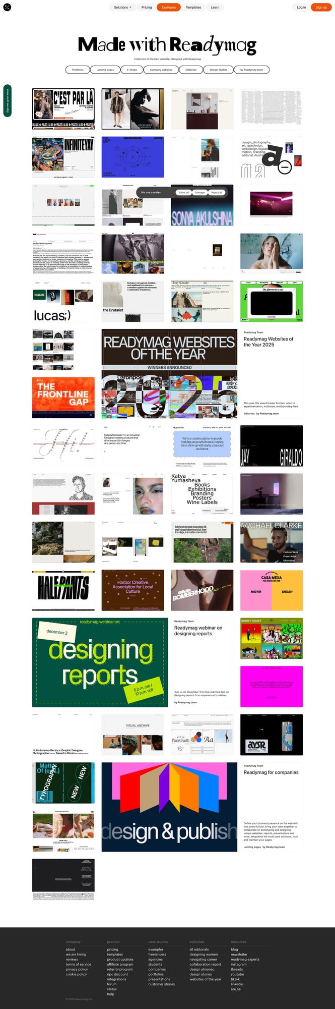
Gallery / portfolio layout. Clean serif typography, generous whitespace, image-text pairings with structured CV/resume section. Good reference for how to present detailed content with editorial precision.
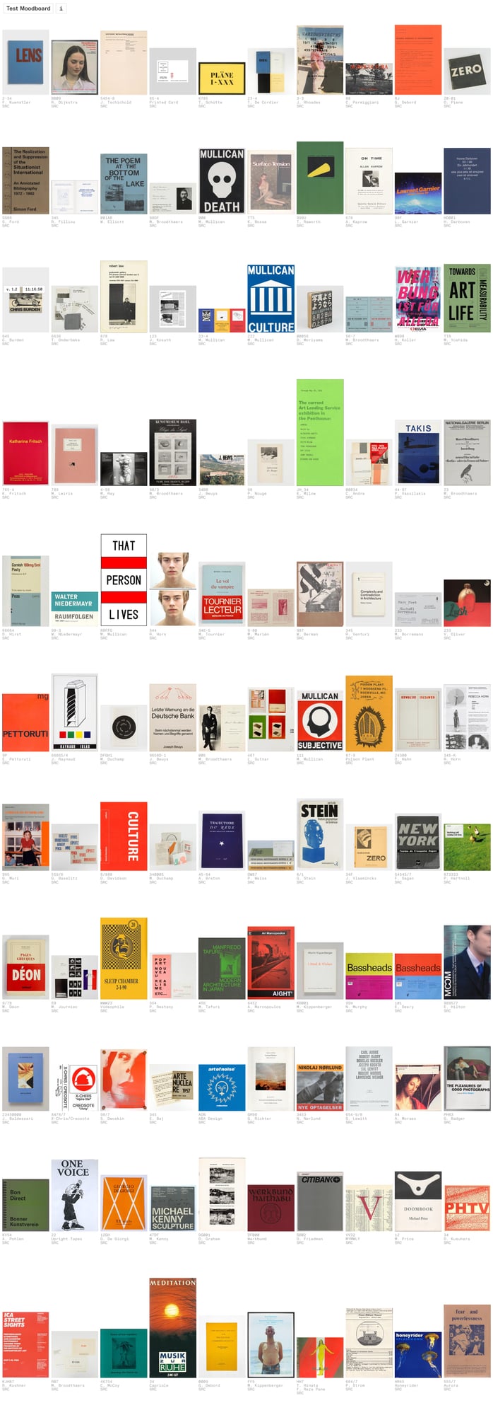
Dense grid of book covers / print ephemera. Masonry-style layout showcasing hundreds of items. Excellent reference for how geometric density and repetition can create visual richness — echoes Werkstätte pattern sensibility.
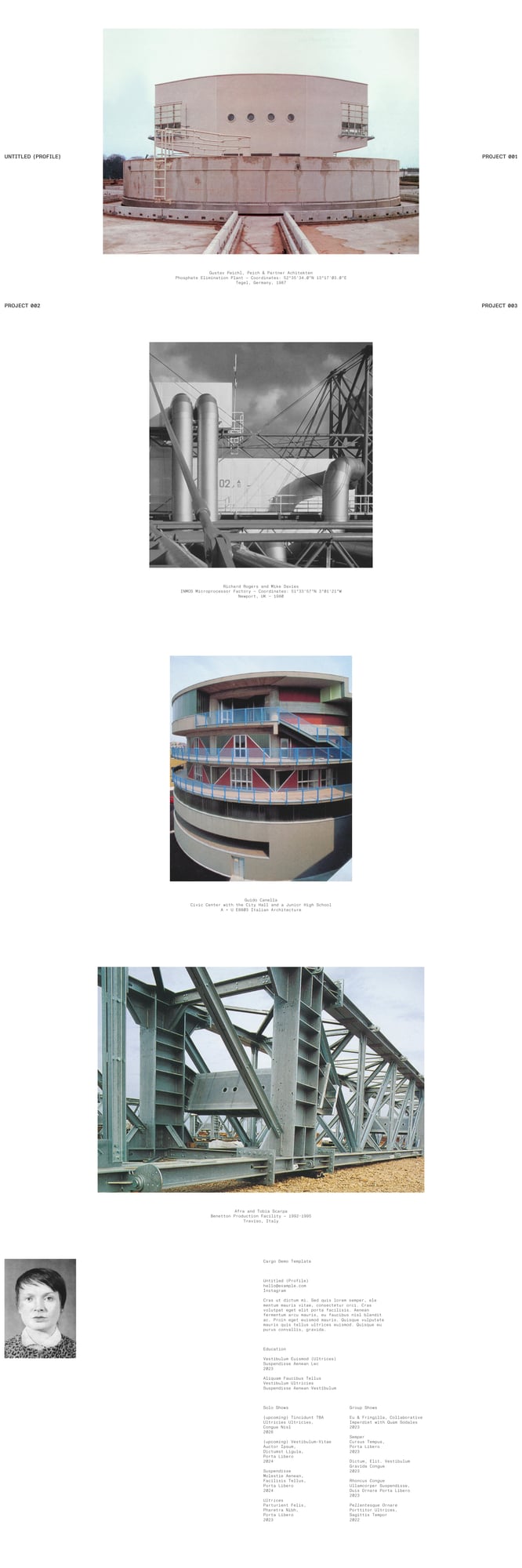
Architectural portfolio. Large-scale imagery with precise typographic captions. Minimal nav, monospaced labels. The industrial aesthetic pairs well with the geometric precision of Vienna Secession.
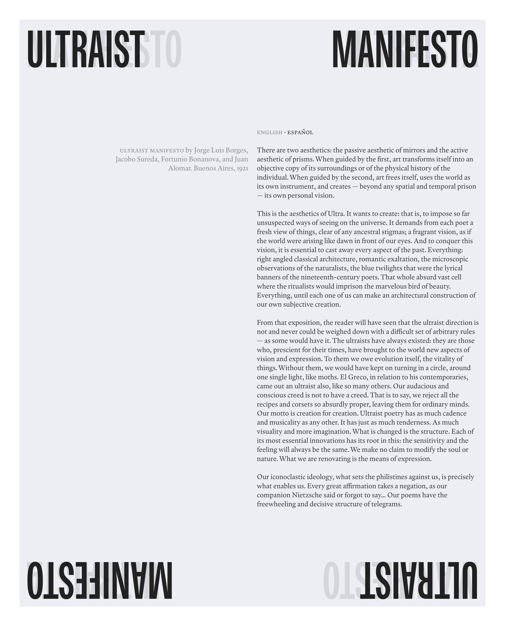
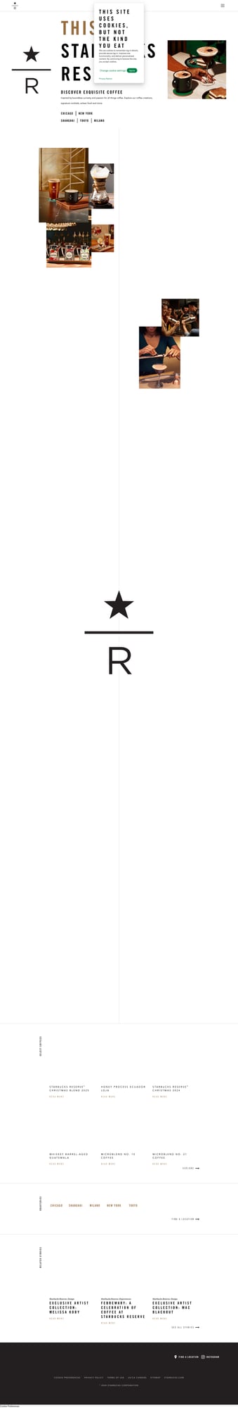
Monumental typography + editorial layout. Massive condensed type at top/bottom frames the body text. Strong black bars. This architectural use of type echoes Secession exhibition posters and Ver Sacrum layouts.
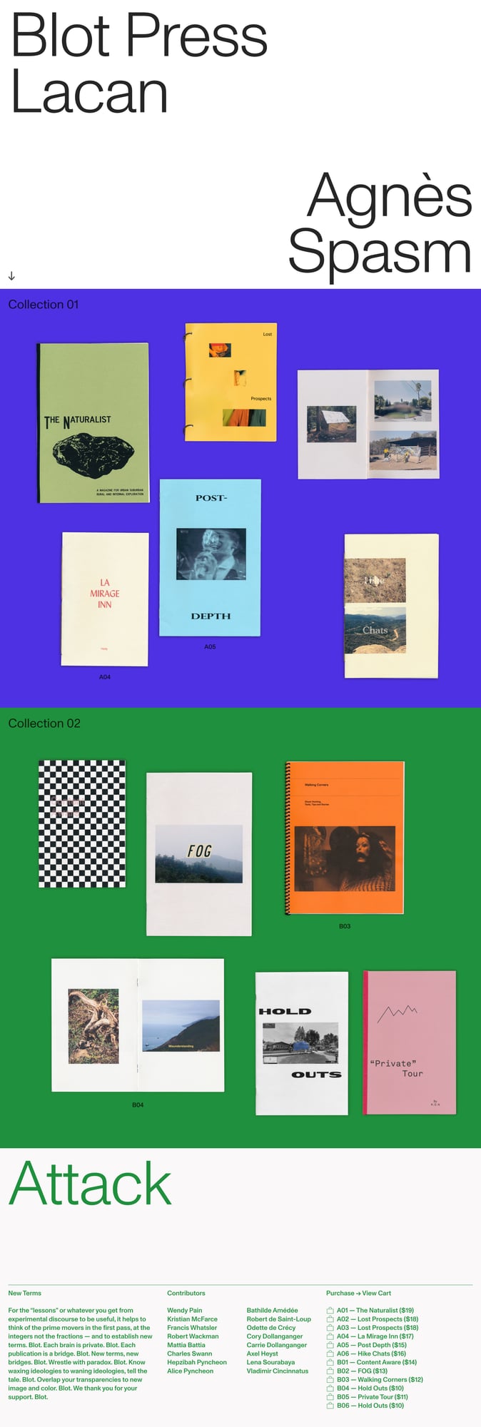
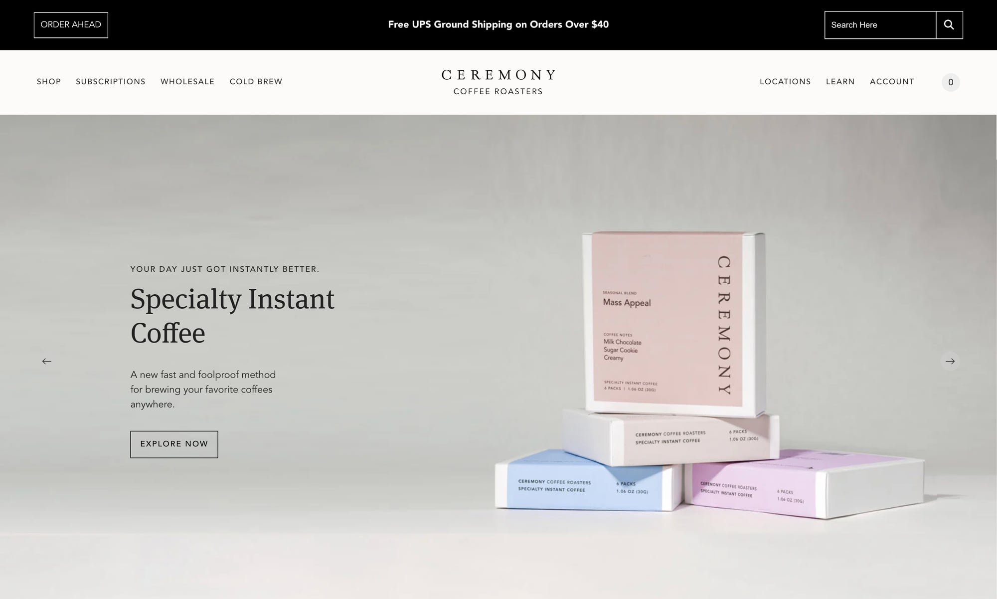
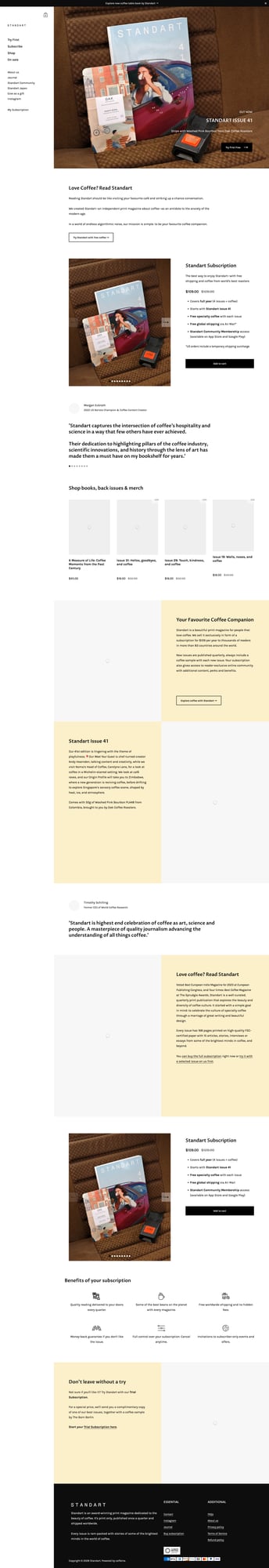
Bold color blocking + editorial product display. Saturated section backgrounds, mixed serif typography, publication grid. Reference for how strong color planes can organize content — adaptable to black/white/gold palette.
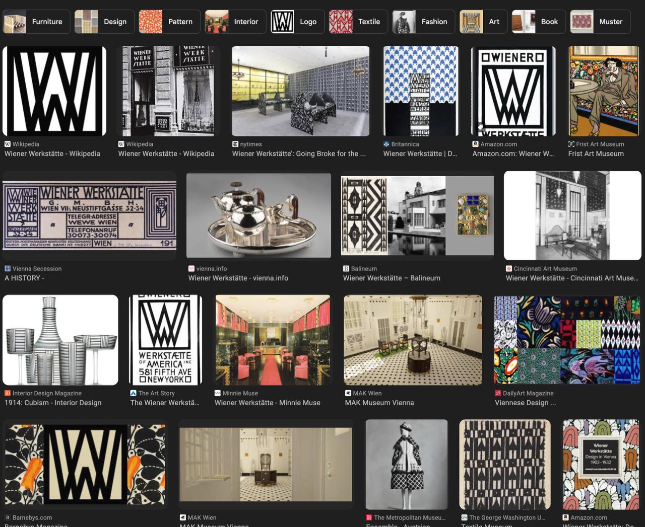
Graphic identity / icon system display. Bold geometric icons on white, organized in grid. References the pictogram tradition of Wiener Werkstätte — where every element from logos to utensils was designed as a unified system.
Showcase of editorial web design. Mix of portfolio, editorial, and experimental layouts. Notable: bold type treatments, asymmetric grids, dark themes, and the overall precision of layout that Readymag enables. Several examples show museum/gallery aesthetics relevant to our Werkstätte inspiration.
Exhibition page showing key Werkstätte objects. Otto Prutscher clock (silver-plated metal, jade — the geometric precision), Koloman Moser's "Golden Butterflies" wallpaper pattern. These objects embody the design language we're translating to web: geometric forms, precious materials, craft.
The actual Secession building's website. Bold black/white design, strong typographic hierarchy, marquee text scrolling. Features the Beethoven Frieze by Klimt. This is the living institution — their web design uses bold sans-serif type, high contrast, and editorial grid that modernizes the Secession spirit.
Comprehensive exhibition microsite. Shows the breadth of Vienna Secession: Klimt, Schiele, Hoffmann, Moser, Wagner. Dark header, structured navigation by discipline (Painting, Secession, Architecture, Decorative Arts). The visual density of artworks arranged in a mosaic layout is itself a reference for our grid system.
Historical overview with key concepts. Documents the Gesamtkunstwerk philosophy — total work of art where every element is designed as part of a unified vision. This is the core principle: the website itself should feel like a complete designed environment, from navigation to footer.
Dark, cinematic, luxury coffee. Black backgrounds, large-scale photography, script wordmarks, warm earthy tones against darkness. The most "luxury" of the specialty coffee sites — closest to what we're building. Note the alternating dark/light sections and editorial pacing.
Clean, elevated, spaced typography. Wide letter-spacing in the logo, large hero with product photography, muted warm palette. The spacious layout and deliberate restraint feels premium without being pretentious. Good reference for navigation structure and product presentation.
Luxury coffee sub-brand. Star/R monogram, warm photography with deep shadows, serif typography, vertical rhythm. The asymmetric image placement and generous whitespace create a gallery-like experience. Note the gold/copper tones in product photography.
Coffee-as-culture editorial. Print magazine for specialty coffee. The site treats coffee with the seriousness of art/design publishing. Serif headings, testimonial quotes, subscription-focused layout. Reference for how to position coffee as a cultural artifact, not just a commodity.
Shaun's Google Images finds + deeper research into patterns, letterheads, and interiors.
The full visual landscape. WW letterhead, Fledermaus cabaret checkerboard floors, blue/white tile patterns, bold geometric logos, interiors with zigzag wall patterns. Note the recurring motifs: interlocking W monograms, strict rectilinear grids, black/white/gold dominance.
The signature motif. Checkerboard on everything: textiles, furniture, silverware, architecture. Tight square grids in various scales. Note the blue/white and black/white variants, plus geometric basket weaves and stepped patterns in metalwork.
Pattern density and variation. Geometric textiles, repeating square motifs, abstract floral geometry, colored pattern samples. The range of geometric approaches within strict rectilinear rules — circles within squares, nested grids, diagonal hatching.
Primary source documentation. The WW letterhead by Moser (bold geometry, clean lines, simplified typeface), Fledermaus cabaret interior with checkerboard, postcard designs, graphic arts evolution. Essential reference for typography and layout principles.
Moser's design philosophy. Exhibition design, facade ornamentation, graphic materials, letterheads, posters, magazine layouts for Ver Sacrum. Moser as the geometric DNA of the entire movement — his approach to turning every surface into a designed object.