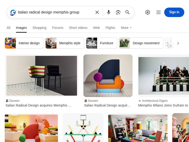
Bold, clashing, provocative. Ettore Sottsass's anti-functional rebellion, Memphis Group maximalism, Alessandro Mendini's ironic color collisions. Design as intellectual protest against good taste.
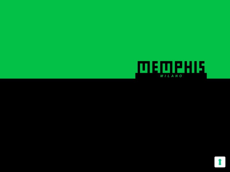
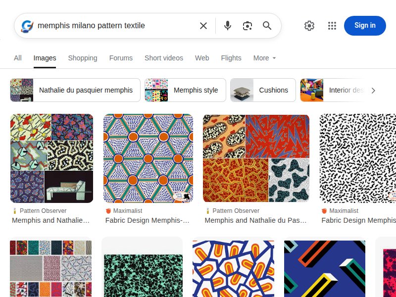
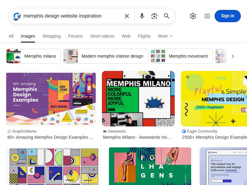
The source. Official Memphis Milano site — clean white background lets bold, colorful objects dominate. Navigation is minimal, letting the visual identity of the work speak. Note how the iconic pattern language appears in product photography rather than site chrome.
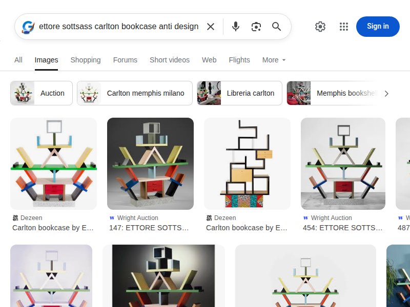
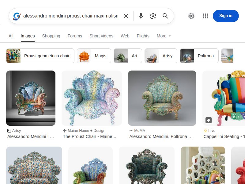
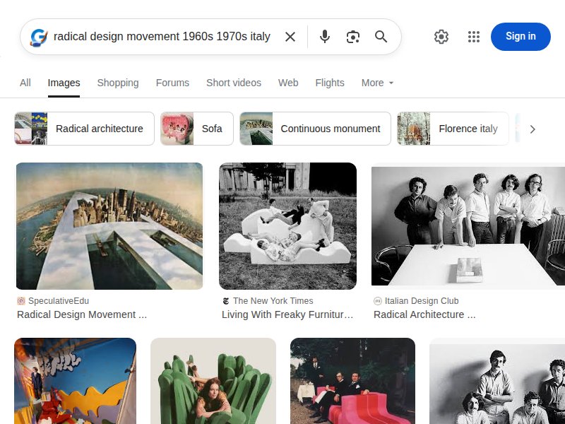
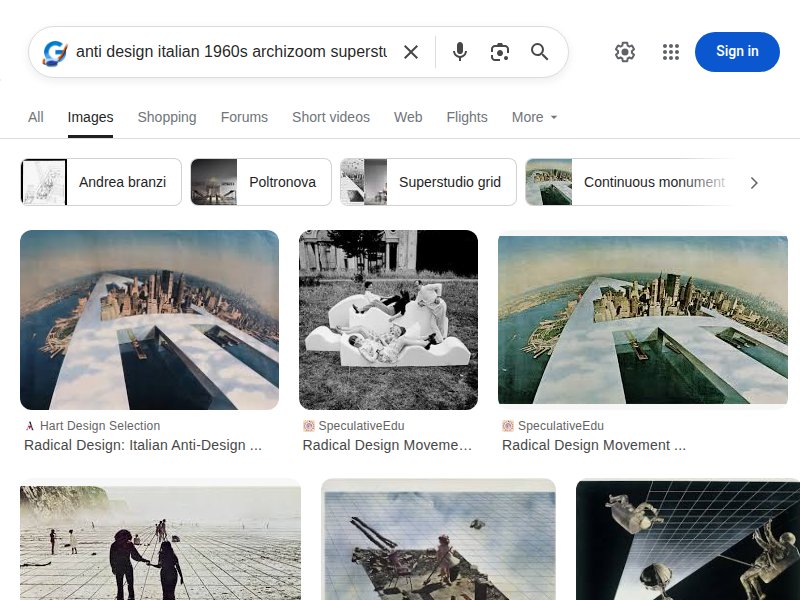
Archival gravitas meets radical work. Restrained site design that frames Sottsass's explosive visual output. The tension between orderly layout and chaotic content is instructive — our site should have MORE of the chaos bleeding into the UI itself.
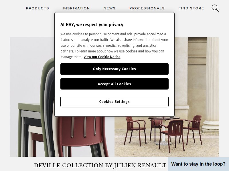
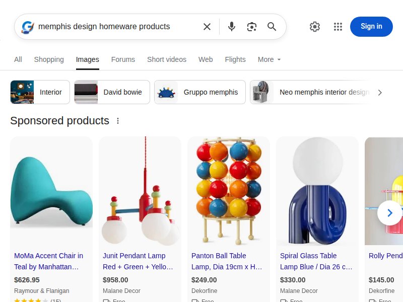
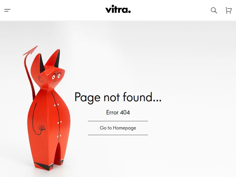
Homeware ecommerce done right. Clean grid, bold color photography, effortless navigation. Good baseline for product browsing UX — but we need to subvert this Scandinavian restraint with Memphis excess.
Design museum meets shop. Excellent product presentation with editorial sensibility. Color-blocking in hero sections. The way they mix editorial content with commerce is a model for our Blog integration.
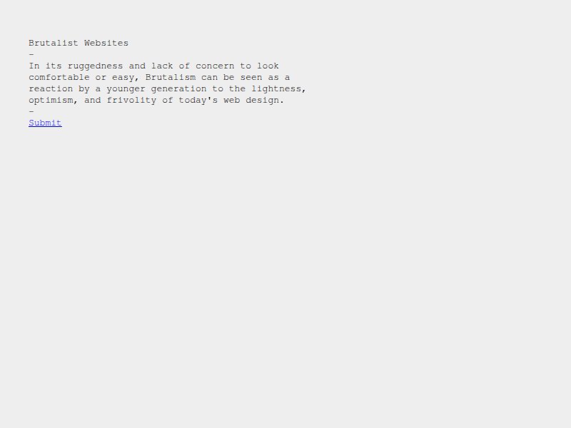
Anti-convention catalog. Raw, unpolished web design that rejects smoothness. Relevant for our provocative navigation and layout choices — the deliberate ugliness that becomes beautiful through commitment.
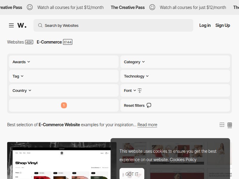
Contemporary ecommerce trends. Reference for current design language — we want to be aware of conventions specifically so we can subvert them intelligently.
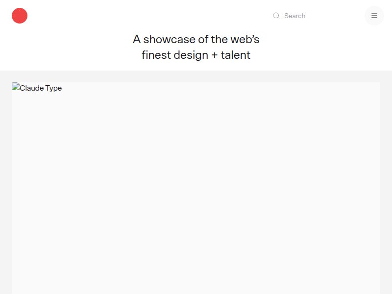
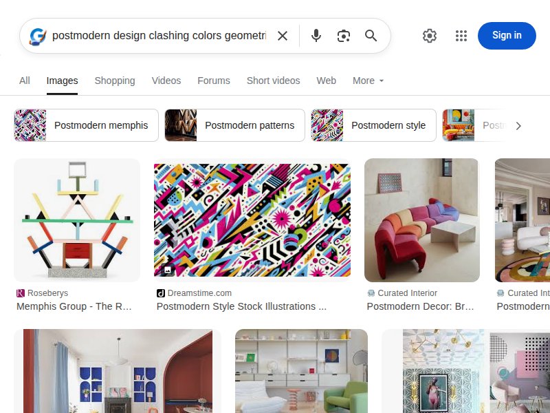
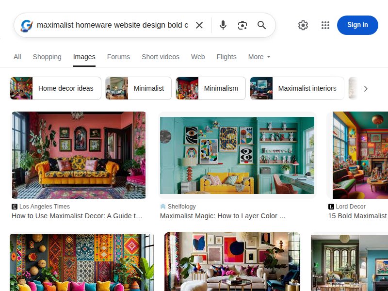
Curated web design gallery. Useful contrast — most featured sites are minimal and restrained. Our design should feel like a deliberate rejection of this tasteful consensus.
Museum context for radical work. MoMA's presentation of Sottsass — shows how institutions frame anti-institutional design. The collection thumbnails are a masterclass in the Memphis color palette.
Italian design institution. The Triennale is ground zero for Italian radical design history. Their exhibition archives show how the movement is contextualized today.
Radical design as luxury commodity. Shows how Memphis pieces are presented commercially today. The contrast between 1stDibs' refined UI and the explosive objects is telling — our site should bridge this gap.
Editorial coverage of the movement. Good overview of Memphis Group's cultural impact and visual language. The editorial framing shows how to write about radical design without domesticating it.
Playful design objects ecommerce. Areaware bridges art and product — their playful approach to homeware is closer to our Memphis spirit than most competitors. Good category structure for reference.
The full visual vocabulary. Carlton bookcases, Tahiti lamps, geometric totems. Primary colors on black, pink on blue, yellow on green. These clashes ARE the brand identity.
The iconic totemic form. The Carlton is THE Memphis piece — its angular, asymmetric shelving with clashing laminate colors is the single most important visual reference for our palette and geometry.
Pattern language. Squiggles, confetti, terrazzo, bacterio pattern. These need to become CSS patterns — repeating backgrounds, border treatments, section dividers.
Maximalist collision of eras. The Proust chair — pointillist painting on baroque furniture. Historical references mashed together without apology. This informs our typography mixing: serif meets geometric sans.
Product context. How Memphis aesthetic translates to everyday objects — vases, clocks, trays, textiles. Shows the product photography style we should evoke with CSS placeholder shapes.
The clash principle. Pink next to orange. Electric blue with mint green. Red touching purple. These "wrong" combinations are the entire point — bold commitment makes them work.
Pattern master. Du Pasquier's patterns for Memphis — bold geometric compositions that feel both ancient and futuristic. Key reference for our CSS pattern system: diagonal stripes, dot grids, zigzags.
The intellectual roots. Superstudio, Archizoom — the 1960s precursors to Memphis. Their infinite grid and conceptual provocations inform the philosophical attitude: design as critique, not decoration.
Digital Memphis. How designers translate the Memphis aesthetic to web — geometric shapes, bold color blocks, pattern fills, rotated elements. Direct UI inspiration.
Terrazzo as texture. The speckled, confetti-like terrazzo pattern is a Memphis staple. Translates well to CSS with radial-gradient dots on contrasting backgrounds.
Anti-design origins. The radical rejection of "good design" that spawned the entire movement. This attitude — design as provocation, not problem-solving — should permeate every pixel.
Contemporary maximalism. How current homeware brands embrace bold color and pattern. The bridge between Memphis historical reference and present-day ecommerce expectations.