Saul Bass × Film Noir: cut-paper shapes, dramatic diagonals, limited palette (black, cream, vermillion). The record shop as cinema.
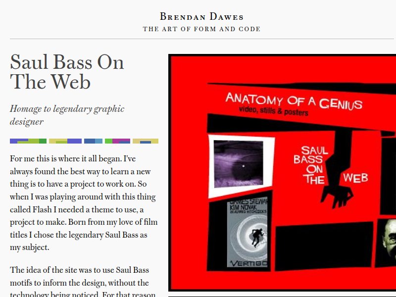
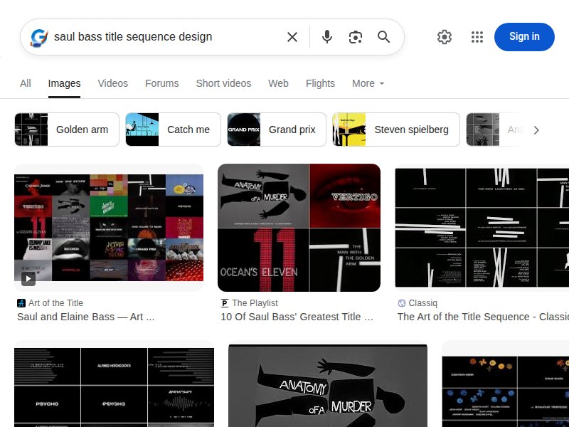
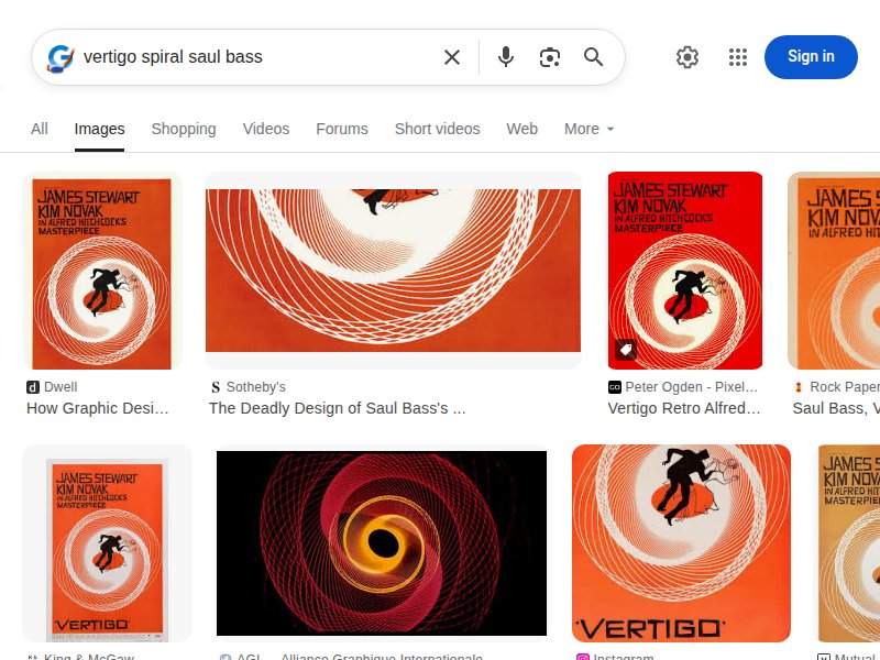
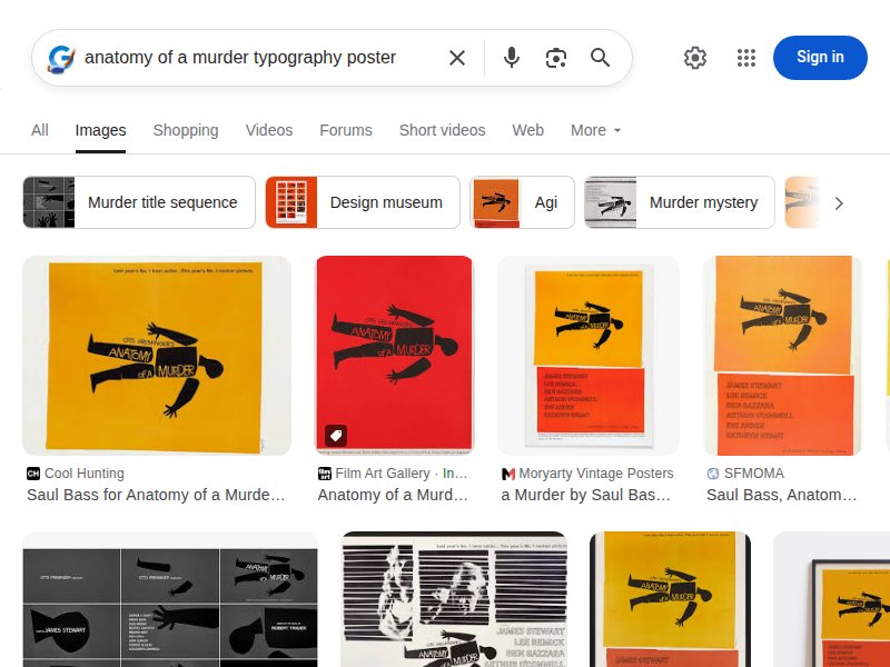
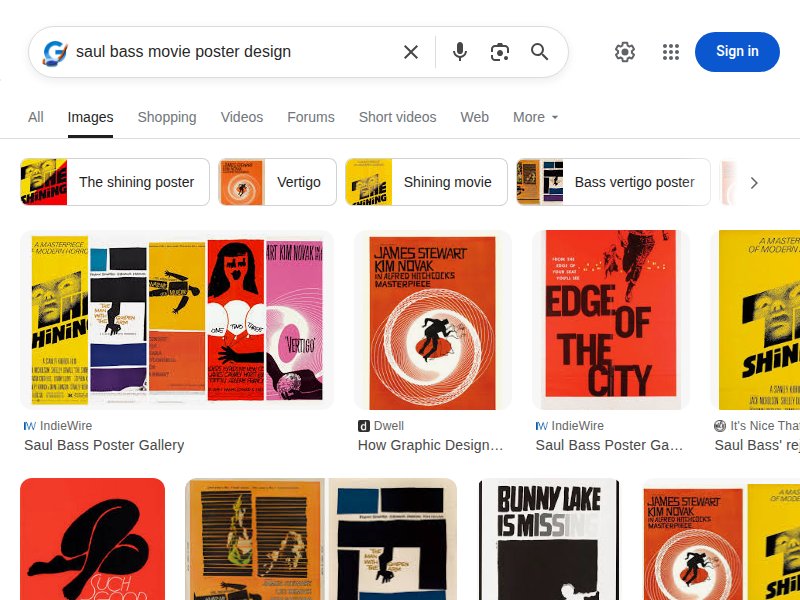
Saul Bass motifs translated to web. Uses Bass's visual language — bold shapes, limited color, dramatic composition — as the foundation for interactive web design. Direct precedent for our approach.
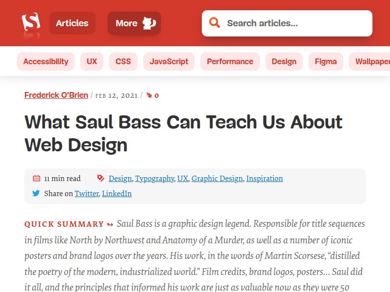
Design theory: Bass principles for the web. Explores how Bass's use of color, shape, and bold simplicity translates to modern web layouts. Key reference for applying cut-paper aesthetics to responsive design.
CSS implementations of Bass's diagonal compositions. Practical examples of translating print-era graphic design into web layouts with CSS transforms and clip-paths.
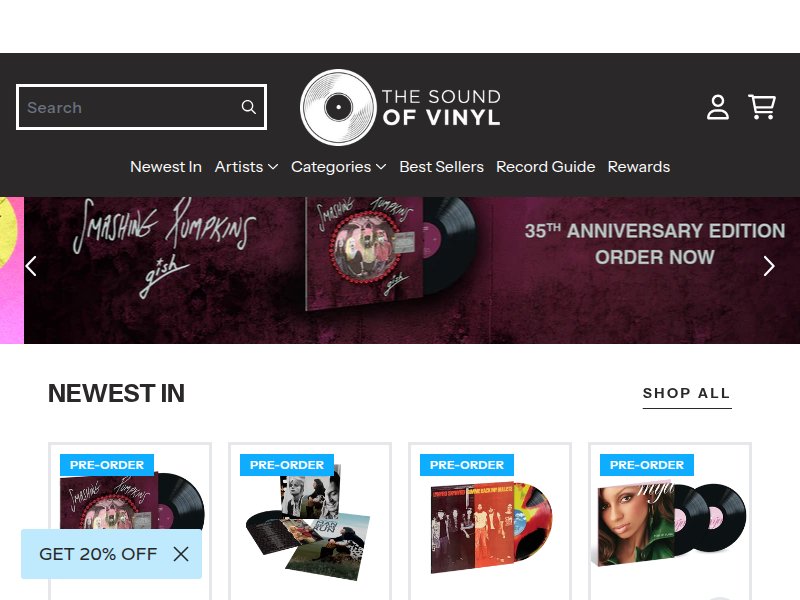
Vinyl e-commerce done right. Clean product grid, genre navigation, vinyl-specific UX (format filters, color vinyl badges). Reference for shop functionality and album card design.
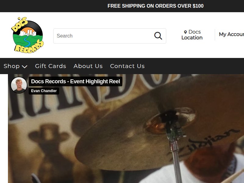
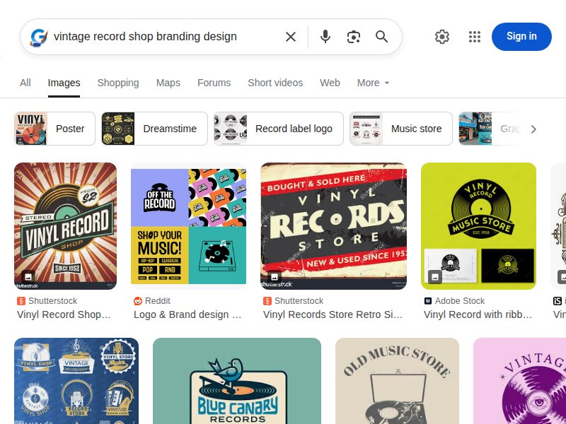
Independent record shop personality. Warm, inviting vintage feel. Shows how a physical store translates its character to web — events, community, buy/sell/trade. Functional reference.
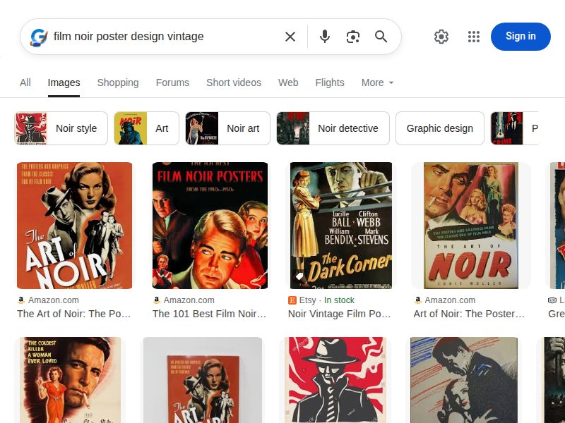
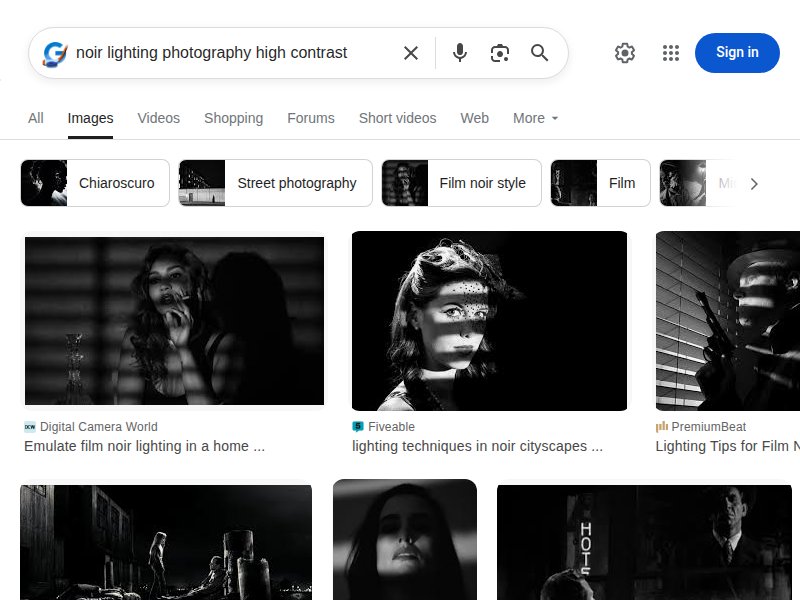
Film noir principles in modern design. Shadows, dramatic lighting, bold typography, and high contrast as design tools. Theoretical grounding for our noir-influenced UI.
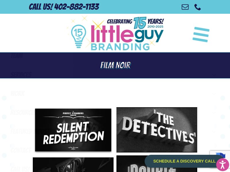
Film noir's influence on branding. Bold typography, stark black-and-white imagery, tension and intrigue through visual contrast. Applicable to record shop brand identity.
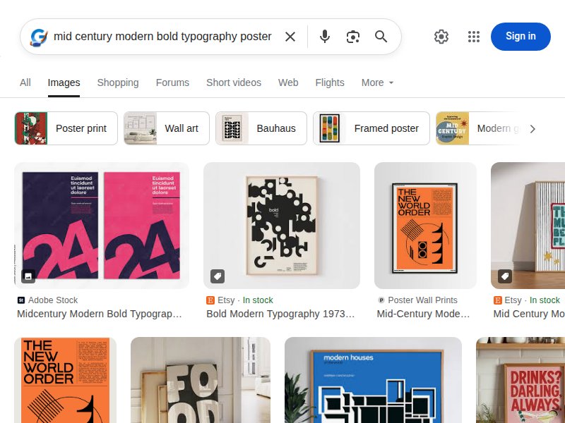
Mid-century design vocabulary. Cut-out imagery, slab serifs, bold shapes, limited palettes. The era that produced both Bass and noir — foundational aesthetic context.
Vintage vinyl e-commerce. Grading system, conservative pricing, collector-focused UX. Reference for the sell/trade and condition assessment features.
Contemporary Bass-inspired work. Curated examples of modern designers channeling Bass's cut-paper aesthetic. Shows the style's versatility and continued influence.
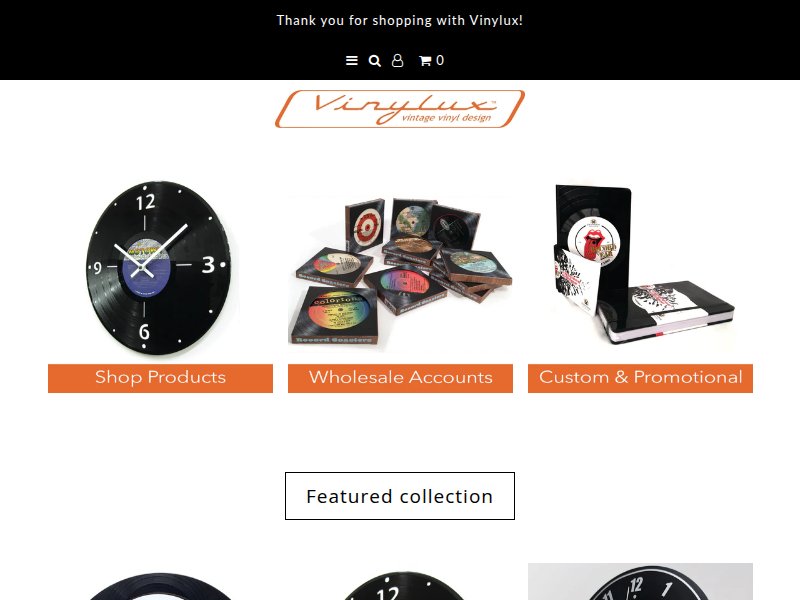
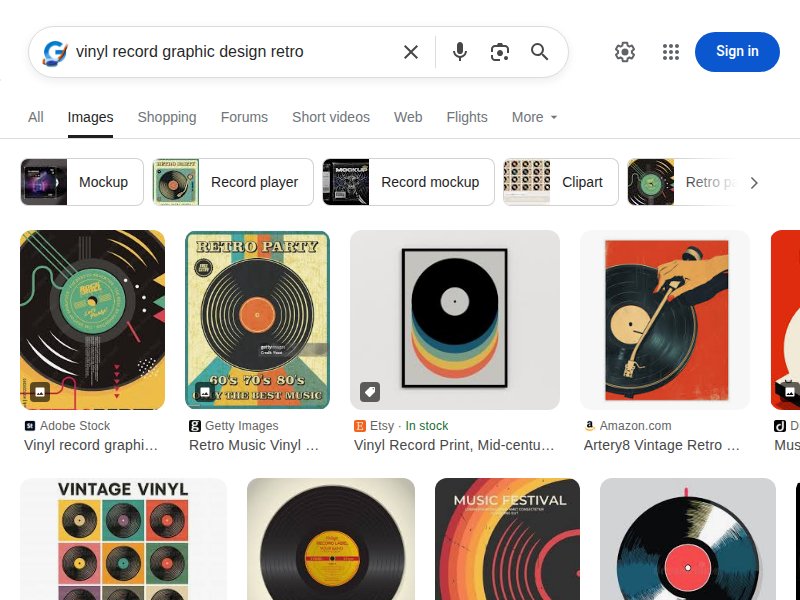
Vinyl as design object. Records repurposed as art and furniture. Shows the visual appeal of vinyl as a medium — grooves, labels, the circular form as graphic element.
Noir typography techniques. High-contrast black-and-white, dramatically shadowed letterforms. Practical techniques for creating the typographic drama we need in headers.
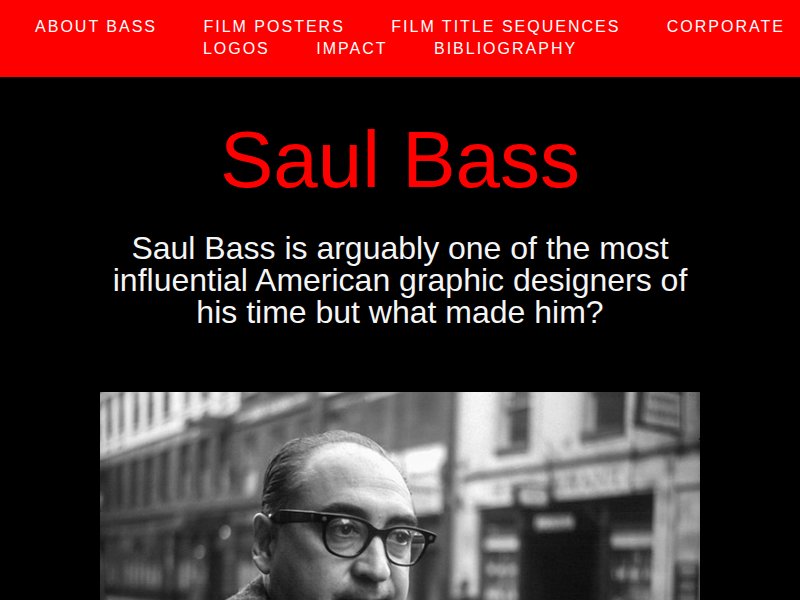
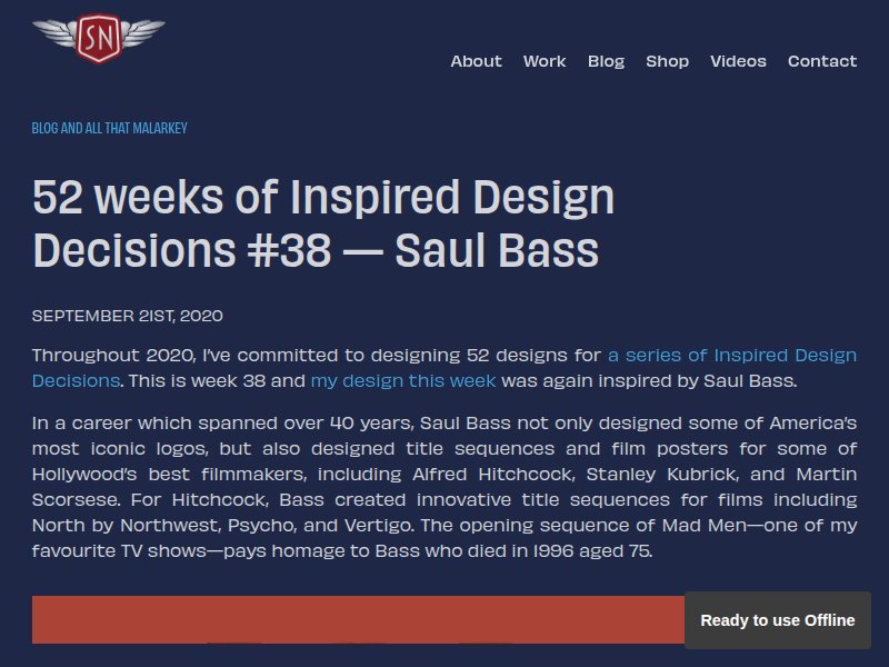
Bass's corporate identity work. Simplistic, minimal style applied to logos and branding. Shows how Bass's principles work at small scales — relevant for our brand mark and icons.
Bold typographic poster design. Large-scale type as primary visual element. Reference for our dismembered section headers and hero treatments.
Typography in context. Real-world font usage across media. Research source for serif/mono pairings and film-poster type traditions.
Font recommendations and pairings. Curated typography inspiration. Reference for selecting Google Fonts that capture the dramatic serif + clean sans pairing.
Film poster typography specifically. How type functions in movie posters — hierarchy, drama, readability at scale. Direct reference for our album-as-movie-poster treatment.
Retro color palettes. Warm, muted tones with bold accents. Reference for our cream/black/vermillion palette and potential supporting colors.
SVG background patterns. Subtle geometric patterns for section backgrounds. Reference for our halftone dot and venetian blind CSS patterns.
Dark/dramatic palettes. High-contrast combinations. Reference for accent pairings — how vermillion and black interact with light grounds.
Bass's title sequence frames. Cut-paper animation, bold graphic shapes, the marriage of type and image in motion. Primary visual vocabulary for the entire project.
Classic noir poster compositions. Dramatic angles, femme fatale silhouettes, high-contrast lighting, bold serif type. The atmospheric half of our visual equation.
Cut-paper technique library. Layered shapes, torn edges, bold color blocks. Reference for our floating shape system and diagonal section dividers.
The iconic Vertigo spiral. Hypnotic concentric forms, the spiral as symbol of obsession and descent. Direct reference for our loading state animation.
Dismembered figure and fragmented type. Bass's most typographically daring poster — letters scattered, body parts as graphic elements. Primary reference for section header treatment.
Record shop visual identities. Logos, signage, bags, stickers. How vinyl shops express personality through design — typography-forward, nostalgic, community-oriented.
The vinyl record as design element. Grooves, labels, sleeves, the circle as form. How to incorporate the physical object of vinyl into web graphics and icons.
Noir lighting patterns. Venetian blind shadows, harsh key lights, deep blacks. Reference for our CSS shadow patterns and the venetian-blind overlay effect.
Bass's complete poster portfolio. The Man with the Golden Arm, Vertigo, Exodus, West Side Story. Each a masterclass in reduction, symbolism, and typographic hierarchy.
Mid-century typographic posters. The broader design context Bass worked within — bold sans-serifs, geometric layouts, limited color. Supporting aesthetic vocabulary.