Rodchenko photomontage, El Lissitzky's dynamic diagonals, revolutionary red and black on cream. Tailoring reframed as political manifesto — every hem a declaration, every suit a revolution.
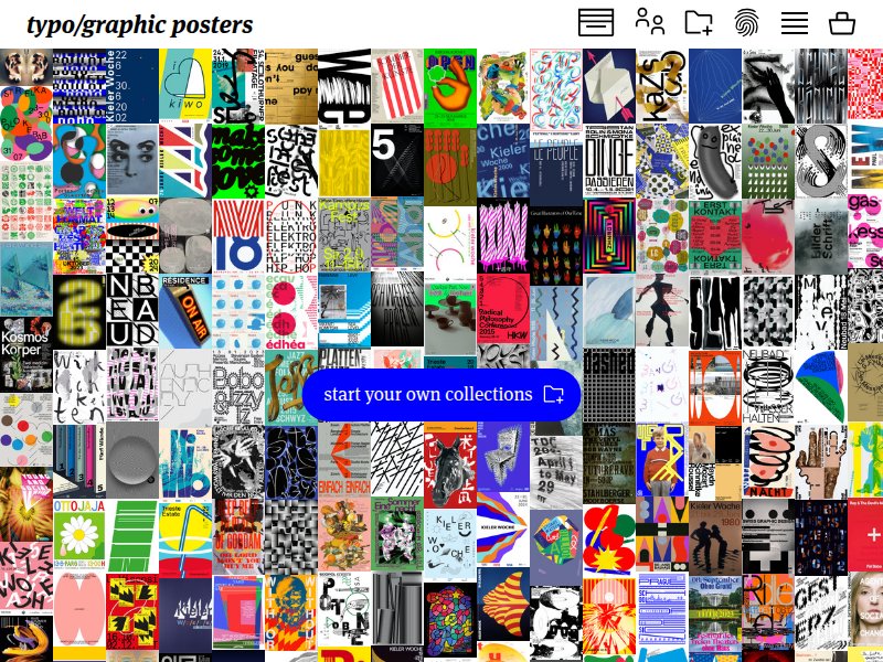
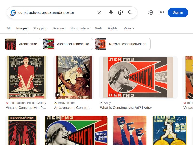
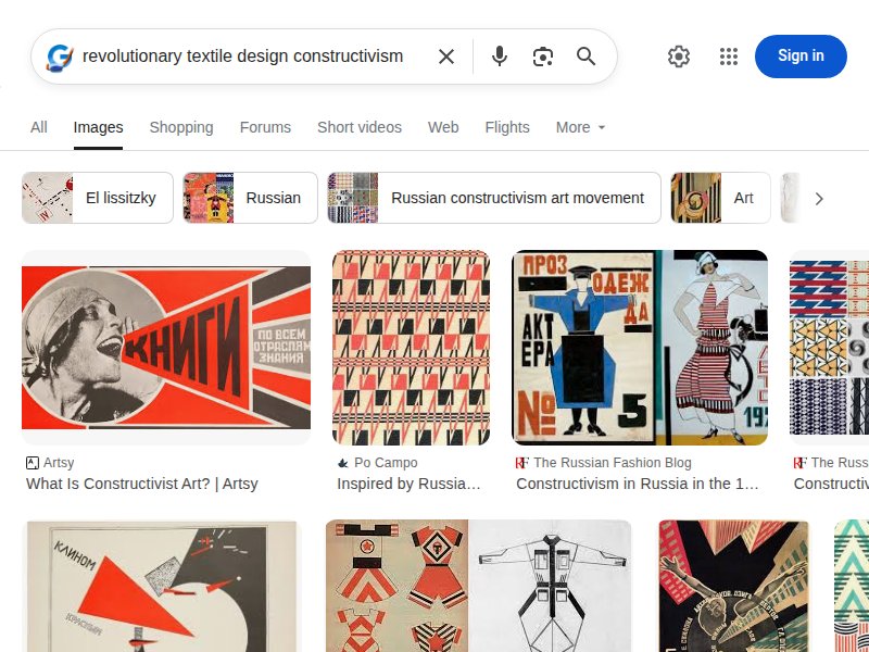
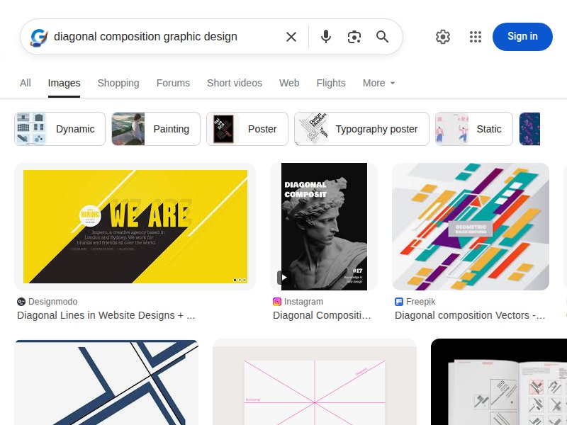
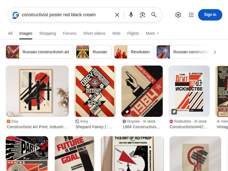
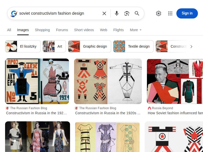
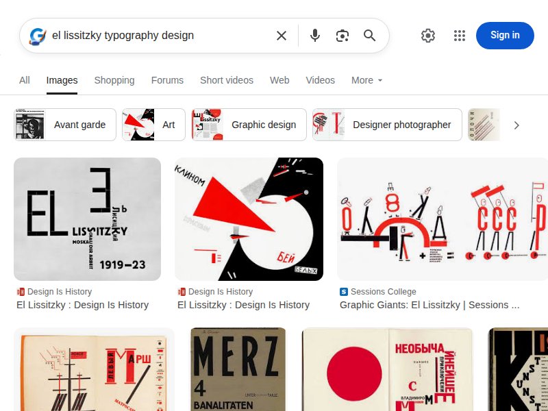
Constructivism overview with modern color palettes. Diagonal composition principles, red/black/cream palette examples, and geometric typography demonstrations.
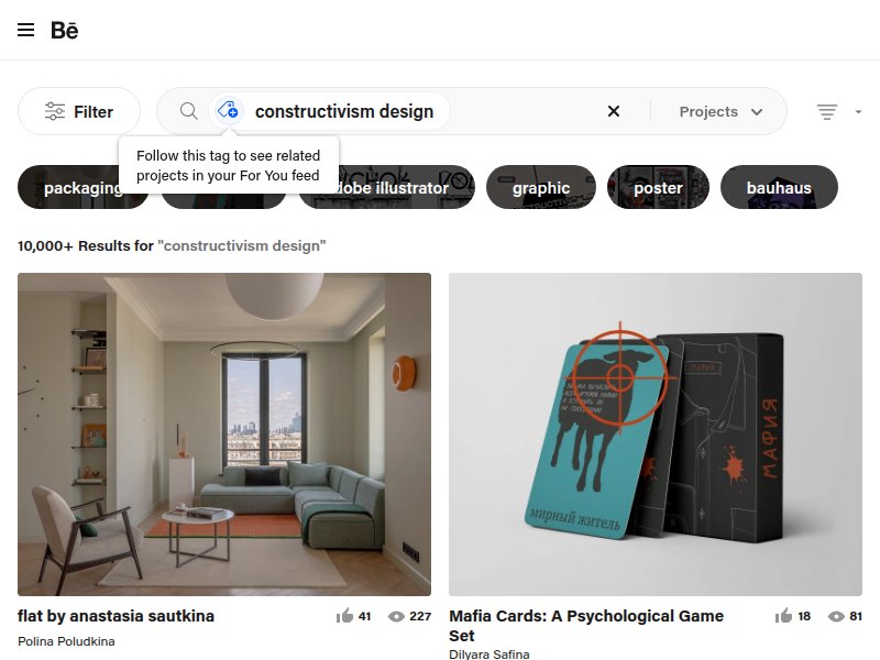
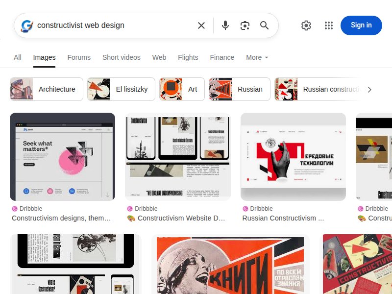
Contemporary constructivist design work. Wide range of modern interpretations — posters, web designs, branding — showing how the aesthetic translates today.
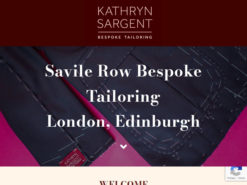
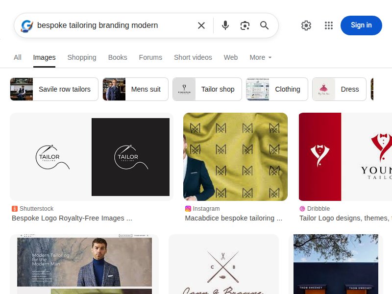
Elegant tailoring site with cream palette. First woman Head Cutter on Savile Row. Clean, luxurious layout — reference for tailoring content structure and tone.
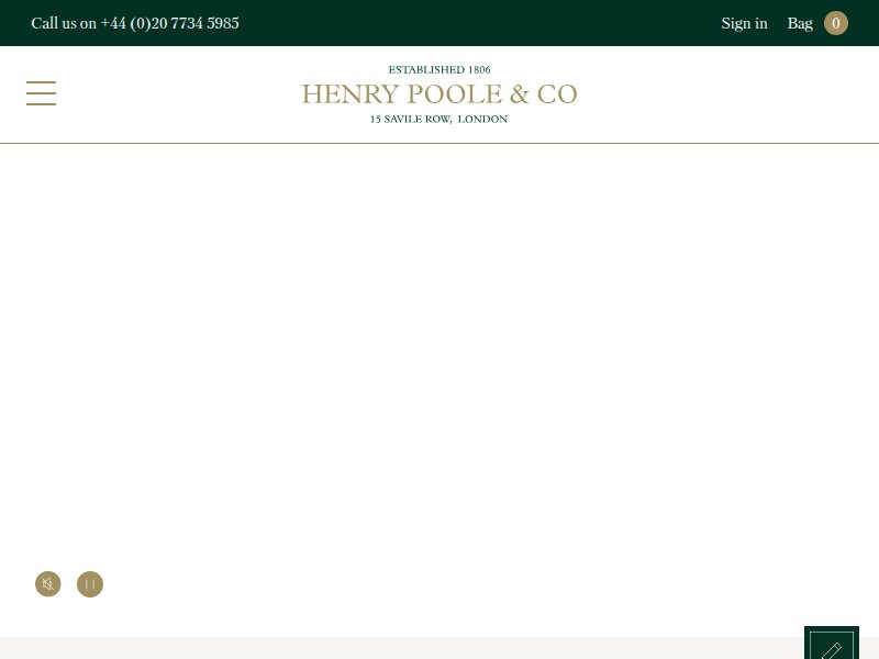
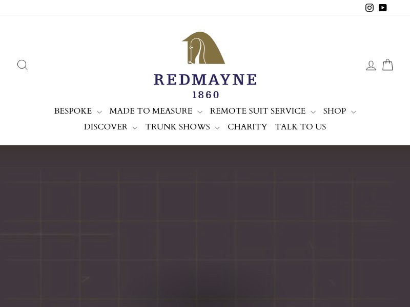
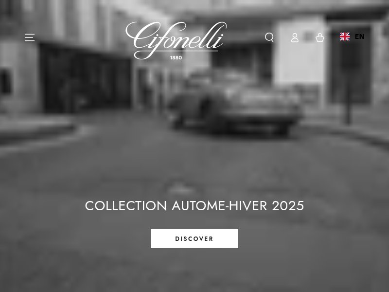
Heritage tailoring brand. Classic, restrained design. Reference for how established tailoring houses present services, history, and craftsmanship.
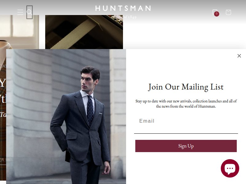
Premium tailoring with editorial photography. Strong visual hierarchy, hero imagery, luxury e-commerce patterns applicable to our services page.
Modern tailoring with bold typography. Clean layout with strong serif headlines. Shows how to make tailoring feel contemporary and inclusive.
Intimate atelier presentation. Process-focused content, measurement details, pattern-making language useful for our Process page.
Heritage branding with warm palette. Warm cream tones, serif typography, understated luxury — close to our desired base palette.
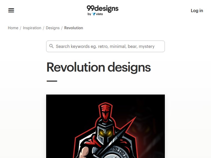
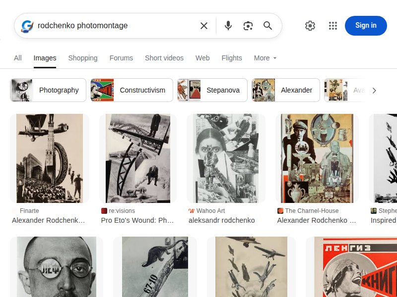
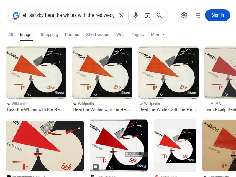
Revolutionary design inspiration. Collection of revolution-themed graphics, logos, and posters showing modern propaganda aesthetics.
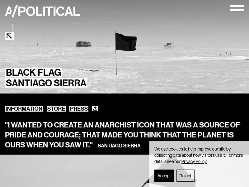
Political art with bold red/black. Red and black diagonal composition, revolutionary symbolism directly applicable to our visual language.
Luxury Parisian tailoring atelier. High-end fashion presentation, editorial photography, craftsmanship storytelling.
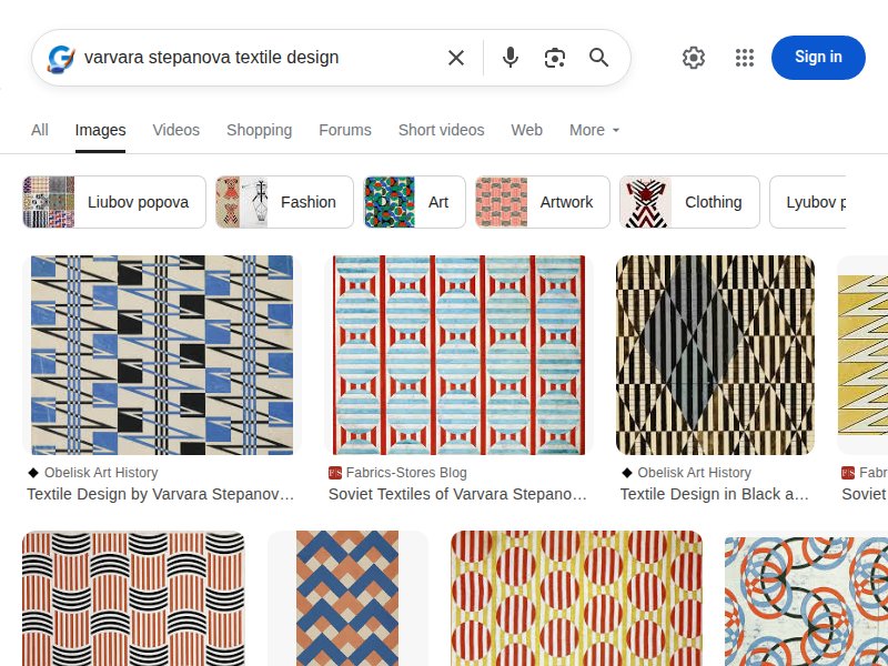
Avant-garde fashion with geometric precision. Minimalist layout with bold geometry and fabric-forward design. Relevant for our Fabrics page.
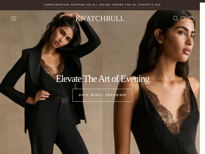
High-fashion with dramatic visual language. Bold contrast, editorial photography, dramatic composition — fashion as statement.
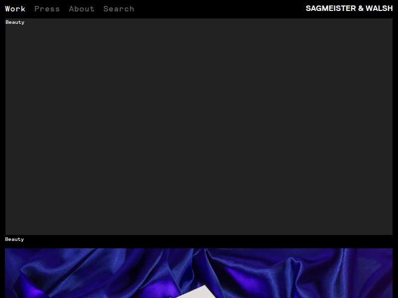
Bold, dark luxury design. Military/industrial naming convention. Strong typography and dramatic presentation relevant to our revolutionary branding.
Accessible bespoke tailoring. Service tiers, pricing transparency, and customer journey layout useful for our Pricing page structure.
Provocative design studio. Bold, unconventional layouts. Shows how design studios break conventions — reference for our provocative design moves.
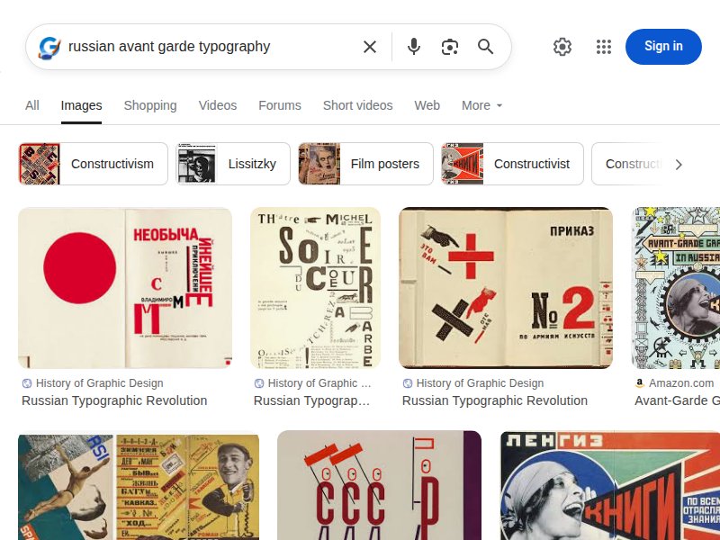
Clean grid-based design portfolio. Masterful typography, strong grid system, black-and-white with selective color — principles we adapt for constructivist layout.
Modern constructivist design shots. Contemporary designers interpreting constructivist principles — diagonal layouts, red/black palettes, geometric typography.
Poster typography at scale. Bold, experimental type treatments. Reference for our propaganda headline styling — oversized, condensed, uppercase.
Real-world constructivist typography. Documented font usage in constructivist-style projects. Validates our Oswald + serif pairing approach.
Typography trends and pairings. Reference for Google Fonts pairing strategies. Validates condensed sans + serif combinations for editorial design.
Russian-influenced typography. Font usage in Russian design contexts — helps identify typefaces that evoke the right cultural associations.
Retro color combinations. Cream, muted red, and black combinations in vintage-inspired palettes. Validates our cream-dominant approach.
SVG background patterns. Geometric patterns applicable to constructivist backgrounds — diagonal lines, grids, and geometric repeats.
Red accent palettes. Various red tones paired with neutrals. Confirms our #CC1A1A choice as strong but not garish on cream backgrounds.
Core visual reference. Rodchenko's photomontage technique — high-contrast photo cutouts, geometric composition, diagonal energy. Direct inspiration for hero imagery.
The Red Wedge — our primary geometric motif. Dynamic triangular composition, red piercing white/cream space. Direct source for our wedge dividers and accent shapes.
Propaganda poster composition. Bold typography, diagonal layouts, red/black on light backgrounds, photographic cutouts. The entire visual language distilled.
Typography as architecture. Condensed sans-serifs, extreme tracking, diagonal placement, text as visual element not just content. Informs our Oswald headline treatment.
Digital constructivism. How other designers have translated constructivist principles to web — diagonal grids, asymmetric layouts, bold color blocking.
Modern tailoring brand identity. How luxury tailoring brands present themselves visually — serif typography, muted palettes, craft photography. The "before" to our revolutionary "after."
Constructivist textiles. Geometric fabric patterns from the Soviet era — Stepanova and Popova's textile designs. Reference for our Fabrics page visual treatment.
Diagonal layout principles. How diagonal lines create movement, energy, and visual hierarchy. Foundational reference for our grid-breaking approach.
Our exact palette in action. Red and black on cream/off-white backgrounds. Confirms the palette creates drama through contrast without requiring dark backgrounds.
Fashion meets revolution. Constructivist approaches to clothing design, fashion illustration, and garment presentation in Soviet-era aesthetics.
Geometric textile patterns. Stepanova's bold geometric fabric designs — circles, lines, and angular shapes. Direct inspiration for CSS pattern system and fabric page backgrounds.
Typography as spatial design. Lissitzky's treatment of text as architectural and spatial element — rotated, scaled, overlapping. Foundation for our diagonal text overlays.